HPV, or the Human Papillomavirus, is one of the most common infections in the United States, yet it remains widely misunderstood, especially among young people. Despite how common it is, many individuals are unaware that HPV can lead to multiple types of cancer OR that a vaccine exists that's capable of preventing the most dangerous strains. This gap in knowledge offered a design opportunity to spread awareness and encourage prevention.
Motivation
I was driven to explore this topic when I recognized that HPV is widely overlooked and preventable! When I was writing this article, I wanted the main audience to be teens and young adults, as that is the most common age to receive the vaccine.

What is it?
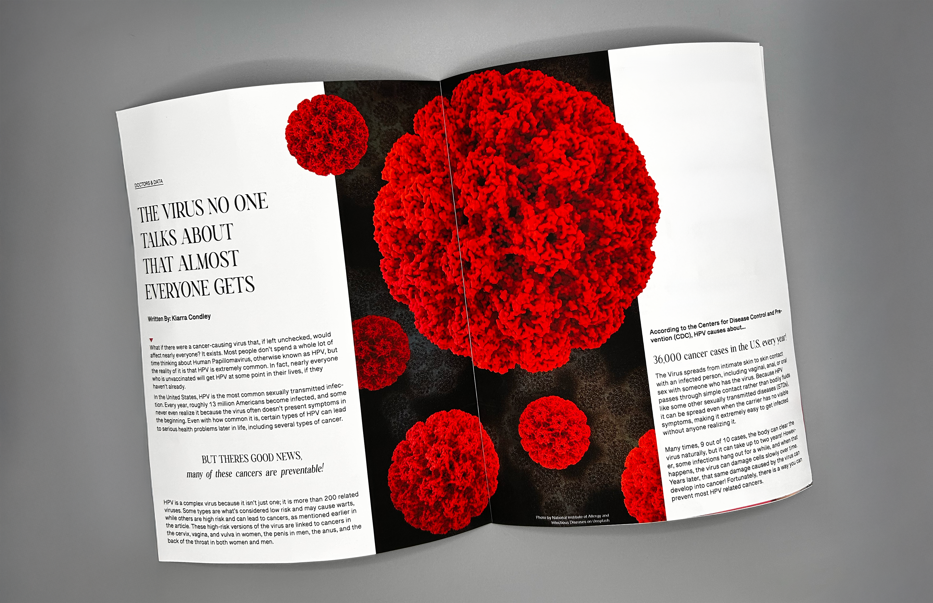
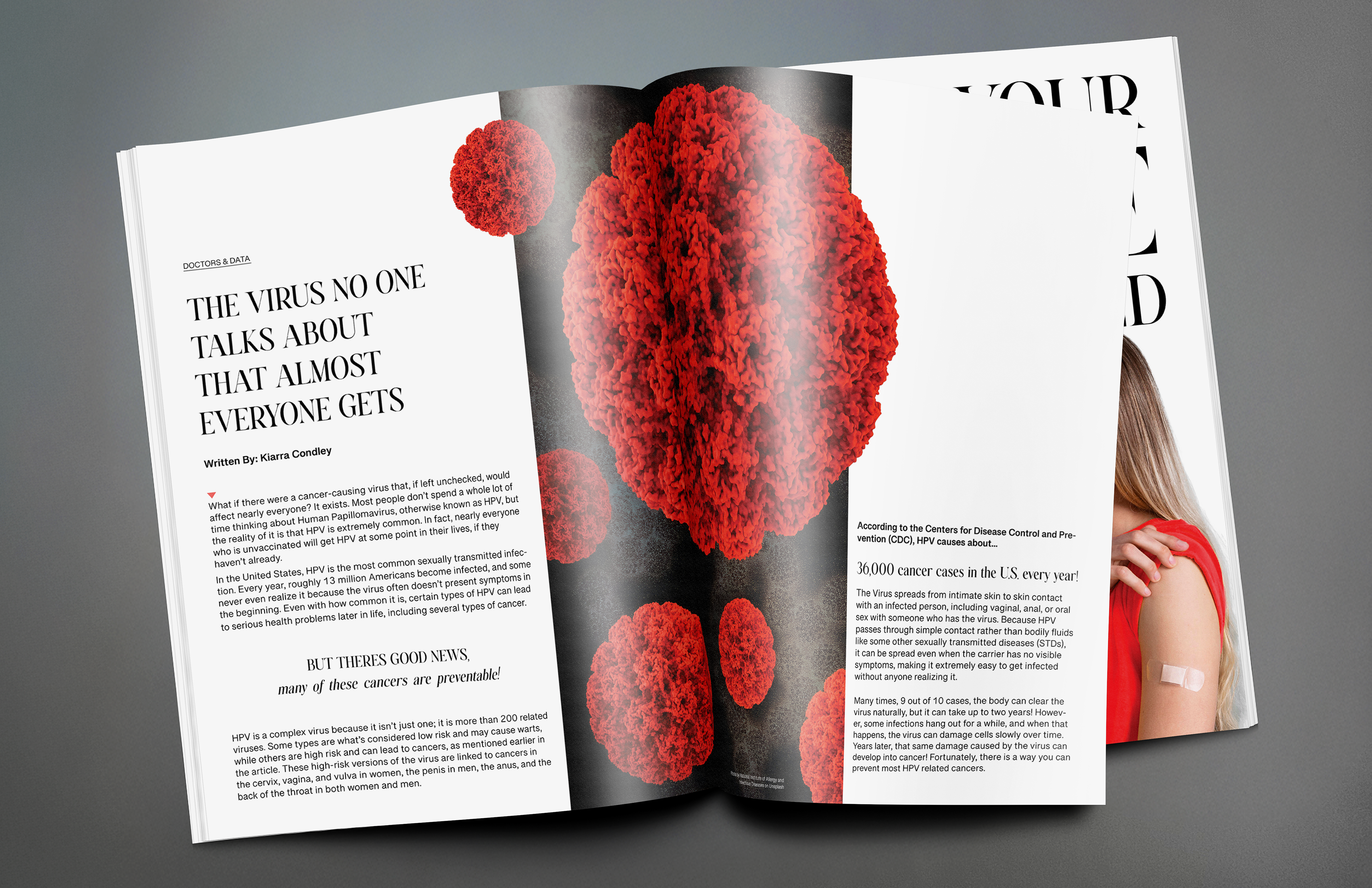
HPV is a group of more than 200 related Viruses spread through intimate skin-to-skin contact. While many infections clear up on their own, certain high-risk types can lead to serious health issues later in life, including cervical, anal, and throat cancers. In light of all this, a vaccine is available that protects against the most dangerous strains, yet awareness and vaccination rates are still lower than they could be, especially among the younger generations.
Research
When looking into this topic to write this article, I focused on gathering clear and reliable information about the Human Papillomavirus and how it affects young people. Most of the data discussed in the article came from the Centers for Disease Control and Prevention (CDC), which provided accurate statistics on infection rates, cancer risks, and vaccine effectiveness. This information helped shape the main message of the article and made sure the content was reliable and trustworthy.
Inspiration
I used the magazine "WIRED" as inspiration for designing my spreads because of how fun and visually appealing I found the layout. Health information these days often feels distant and clinical, or doesn't feel relatable to the reader.
i wanted the project to present information in a way that was visually appealing and easily accessible and relevant to the younger audience.
Layout study
To better understand the original magazine, I created a tracing of the original layout for inspiration. This process involved outlining key layout elements, including grids, columns, margins, gutters, headers, and bleeds.
By breaking the layout down in this way, it allowed me to easily analyze how typography, spacing, and hierarchy worked together to guide the reader. This step led me into the next phase.
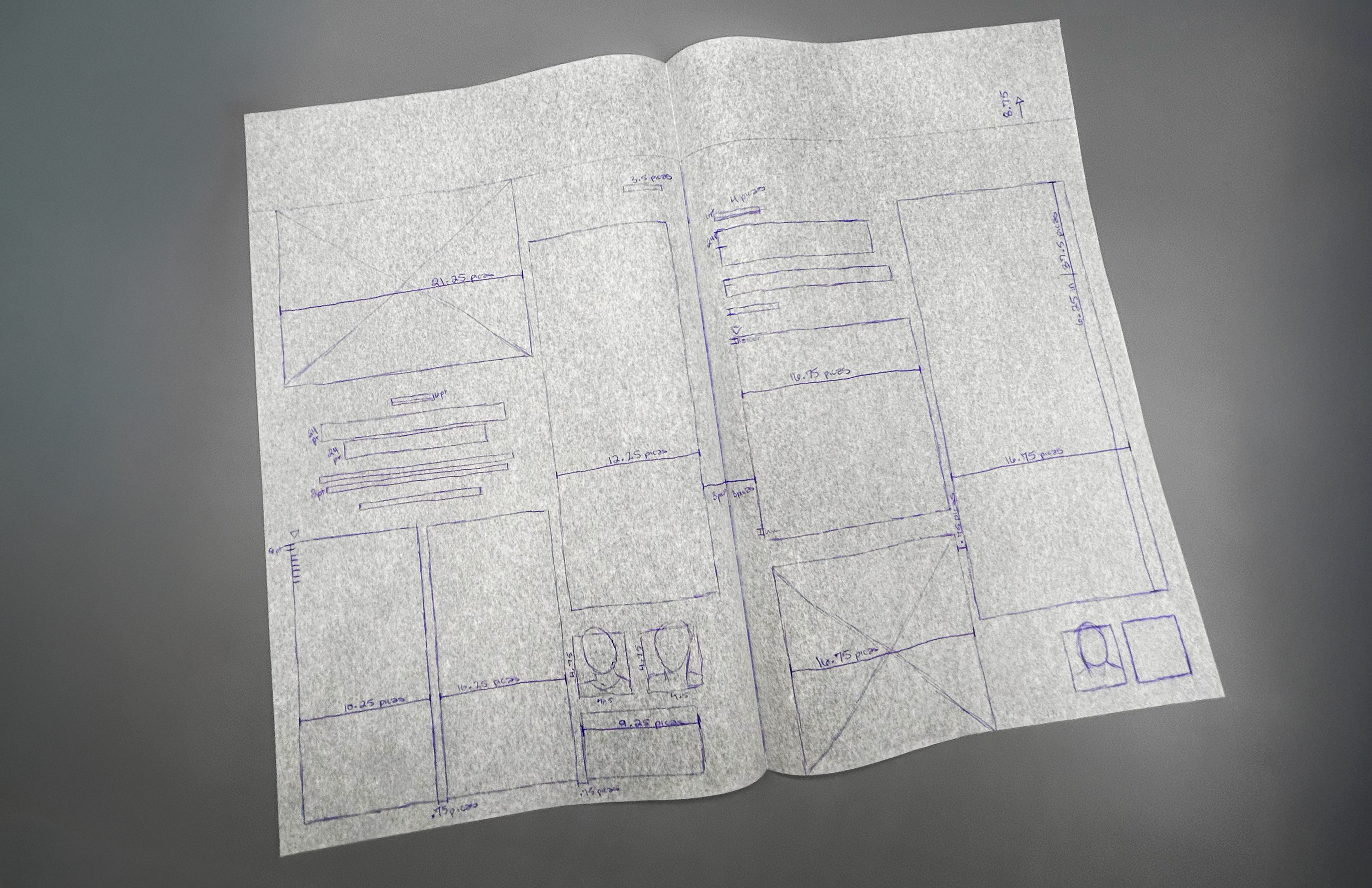
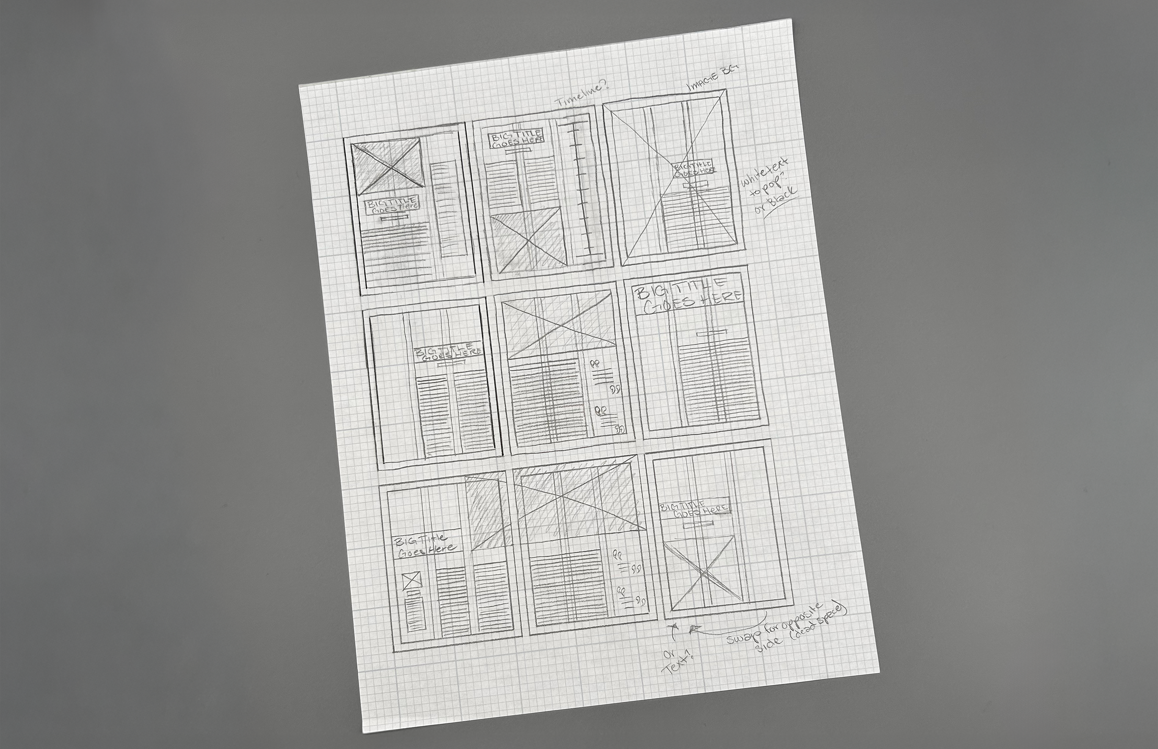
Sketches
After analyzing the layout of the original magazine, initial sketches were drawn out to explore different layout ideas and how the content would be displayed across the magazine spreads. These focused on looking at column structure and attempted to balance visual focus between text and imagery.
Sketching allowed for quick iterations before moving into the process of digital design, where a larger focus landed on hierarchy and the main composition.
Process
Early sketches and designs were too text-heavy, so i made adjustments to improve hierarchy through larger headlines, bigger, stronger imagery, and improved spacing to give the eye a break. Visual elements and typography were chosen early and refined over time to create a more balanced and engaging layout that guides the reader through the spreads.
Purpose
The aim of the article was to translate complex health information into a design format that resonates with younger readers ages 16-25. The design's main focus was to bring awareness to HPV and the danger hidden beneath the surface of the infection, but also to encourage readers to take action, to learn about their health, and protect themselves from the virus. The most challenging part was connecting credibility with approachability, making the content informative without making it feel too overwhelming or clinical.
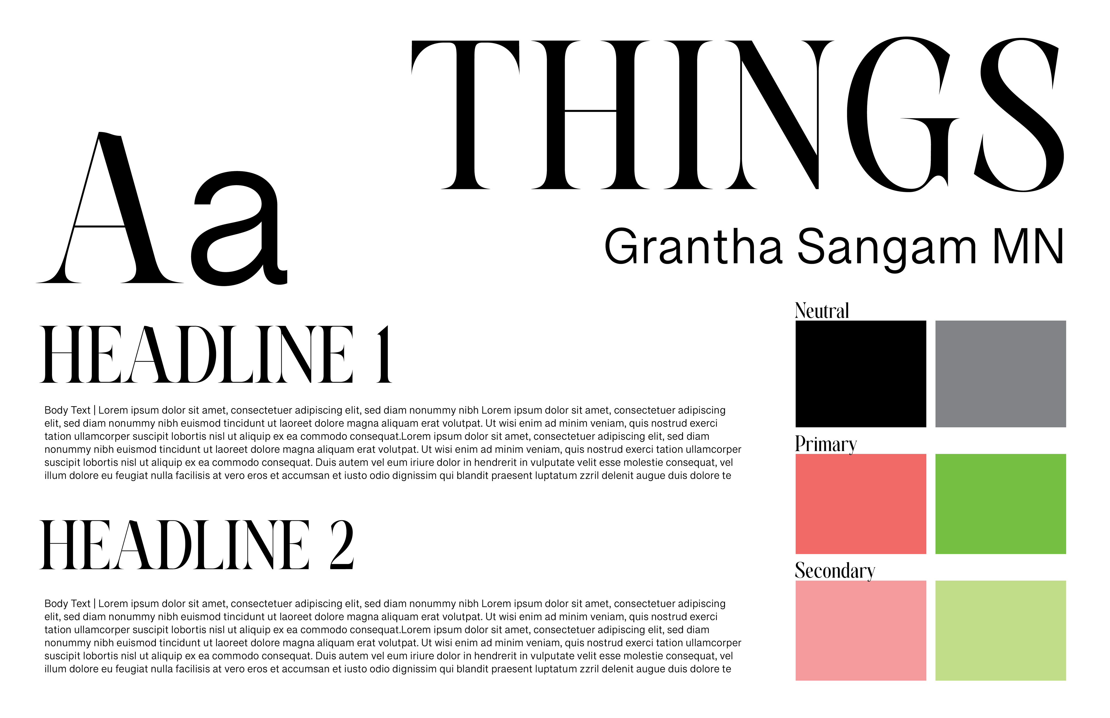
Key Design Aspects
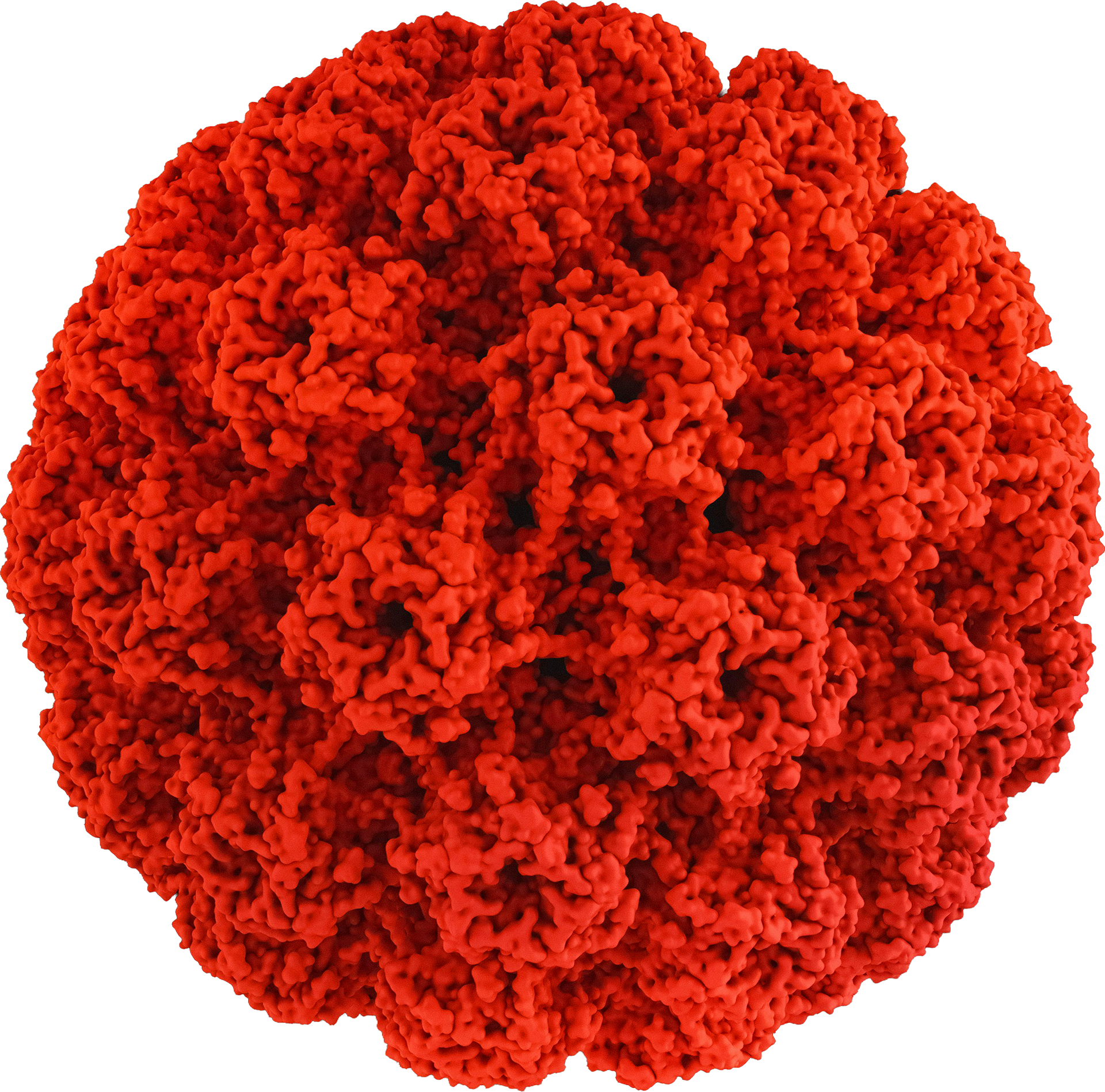
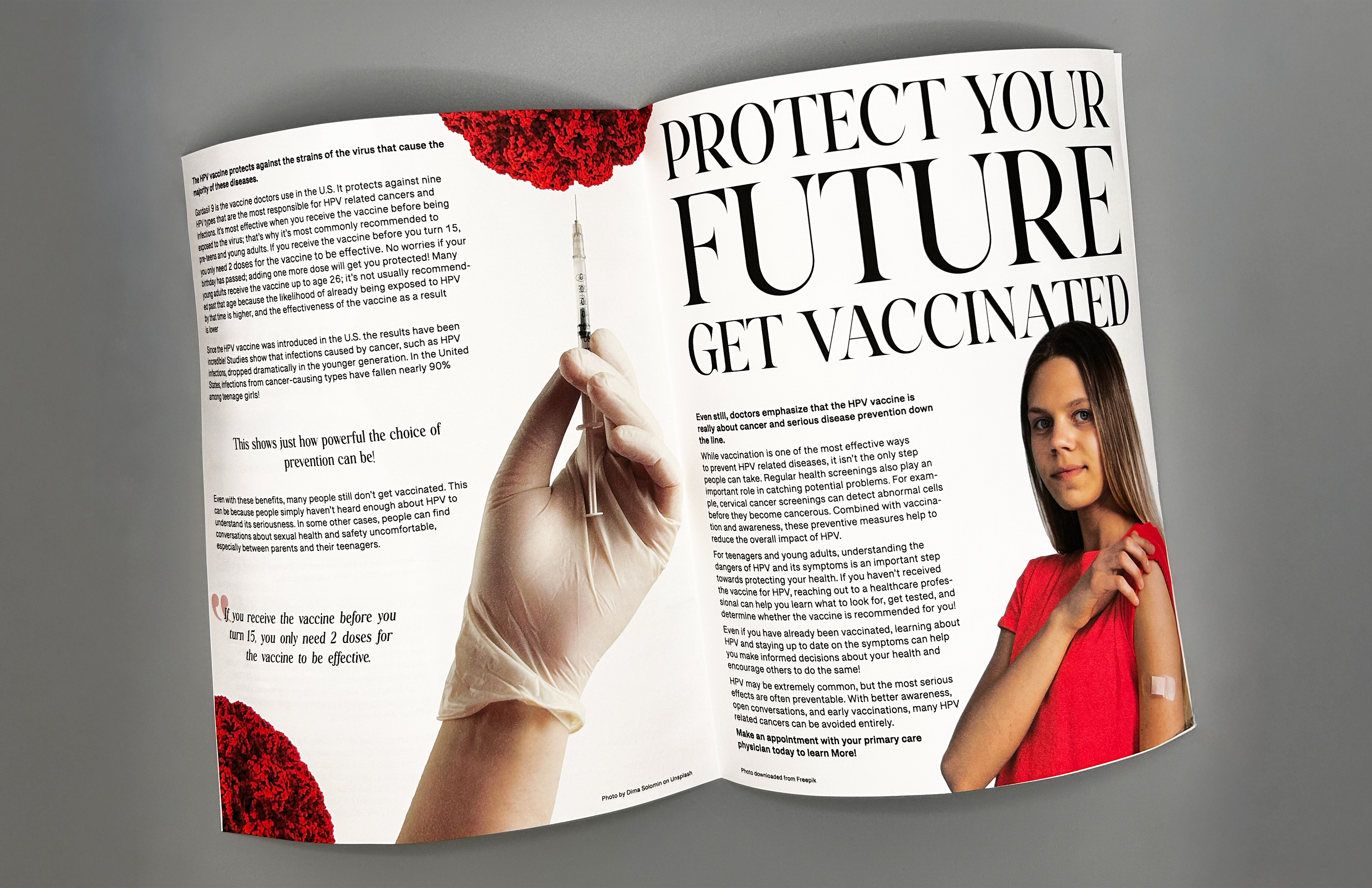
The design uses strong contrast, scale, and hierarchy to guide the reader through the article. Large serif headers make the article feel editorial, while clean sans-serif body text keeps the content readable. The large-scale virus used throughout adds visual impact, conveying the danger of the virus and reinforcing the topic, while the final image of vaccination shifts the message towards action. Small pull quotes break up the text and convey important information, while a simple red color palette creates a feeling of urgency.
Outcome
The final layout presents complex information in a clear and engaging way. Strong hierarchy, bold visuals, and improved spacing make the content easier to navigate. The progression from awareness to prevention helps to reinforce the message, making the article feel more relevant and actionable for a younger audience. Taking all of these things into account for the final design allowed me to win a cohort-voted award for the best clarity in conveying the messaging. Throughout this process, I was able to learn more about a widely overlooked and currently relevant health issue, which gave me the opportunity to spread awareness to others while experimenting with layout design.
References
Centers for Disease Control and Prevention. (n.d.). Reasons to get vaccinated. Centers for Disease Control and Prevention. https://www.cdc.gov/hpv/vaccines/reasons-to-get.html
Centers for Disease Control and Prevention. (n.d.-a). HPV vaccine safety and effectiveness data. Centers for Disease Control and Prevention. https://www.cdc.gov/hpv/hcp/vaccination-considerations/safety-and-effectiveness-data.html
Centers for Disease Control and Prevention. (n.d.-a). Cancers caused by HPV. Centers for Disease Control and Prevention. https://www.cdc.gov/hpv/about/cancers-caused-by-hpv.html
Centers for Disease Control and Prevention. (n.d.-a). Basic information about HPV and cancer. Centers for Disease Control and Prevention. https://www.cdc.gov/cancer/hpv/basic-information.html
Centers for Disease Control and Prevention. (n.d.-c). HPV vaccination. Centers for Disease Control and Prevention. https://www.cdc.gov/hpv/vaccines/
Centers for Disease Control and Prevention. (n.d.-c). Chapter 11: Human papillomavirus. Centers for Disease Control and Prevention. https://www.cdc.gov/pinkbook/hcp/table-of-contents/chapter-11-human-papillomavirus.html
Centers for Disease Control and Prevention. (n.d.-a). About HPV. Centers for Disease Control and Prevention. https://www.cdc.gov/hpv/about/index.html