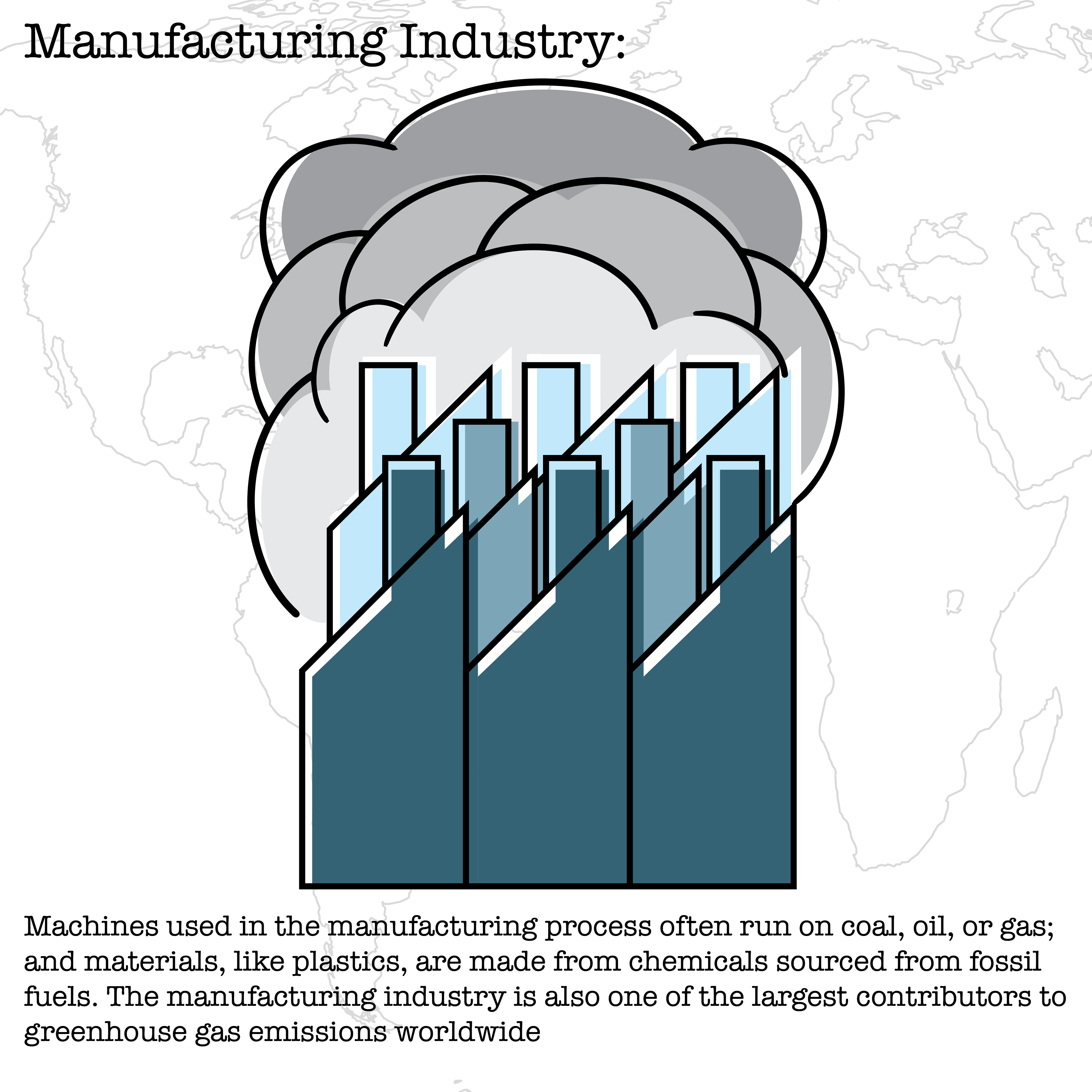
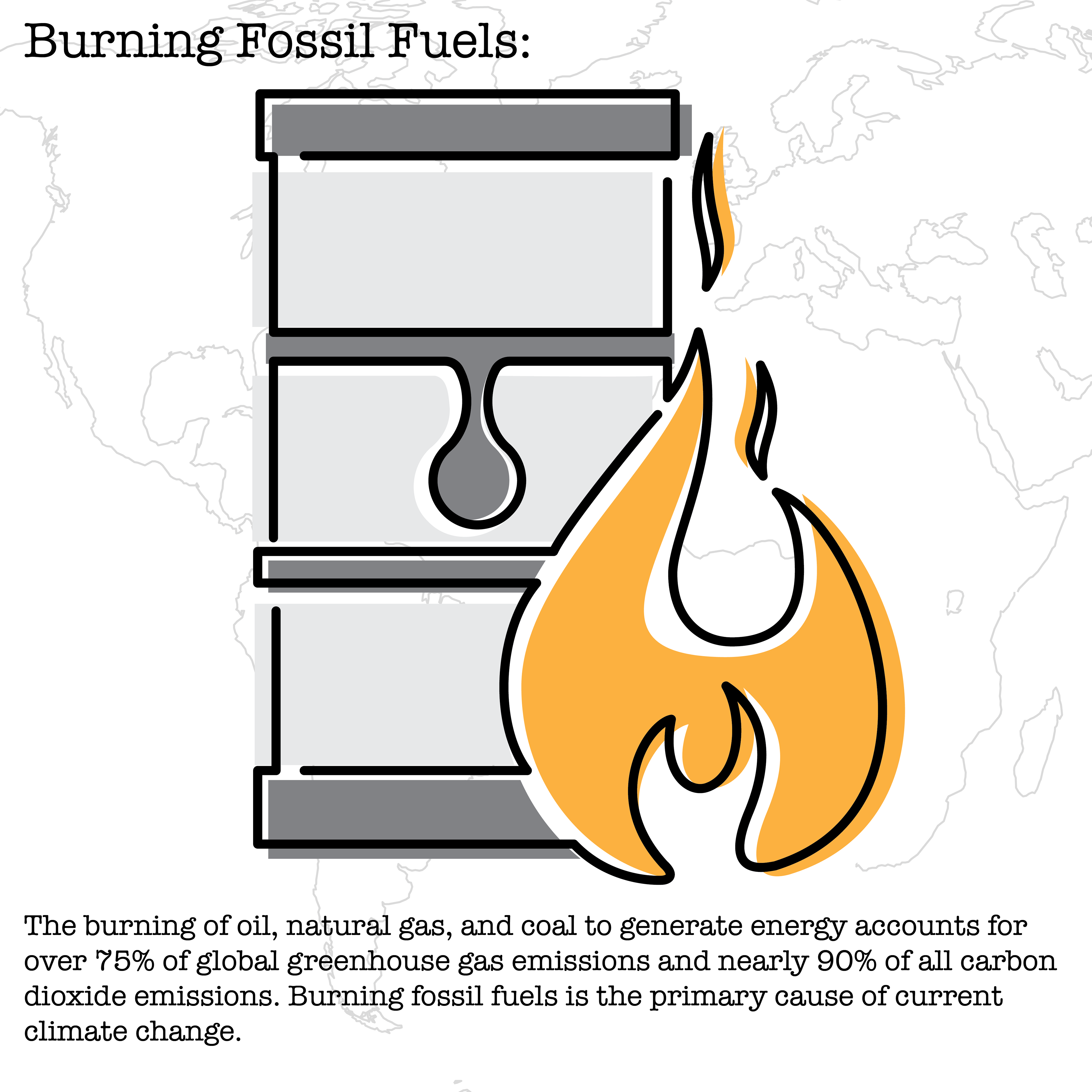
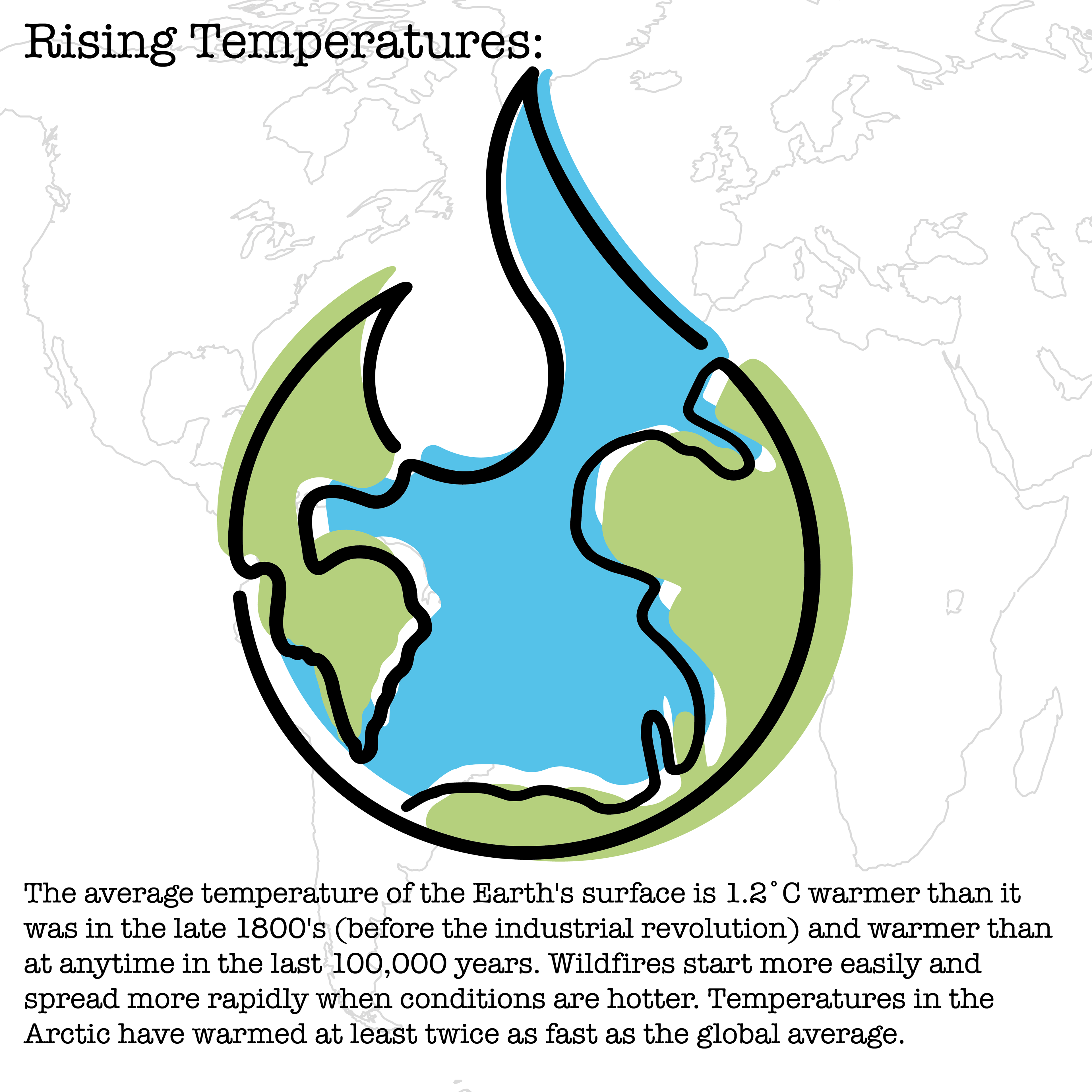
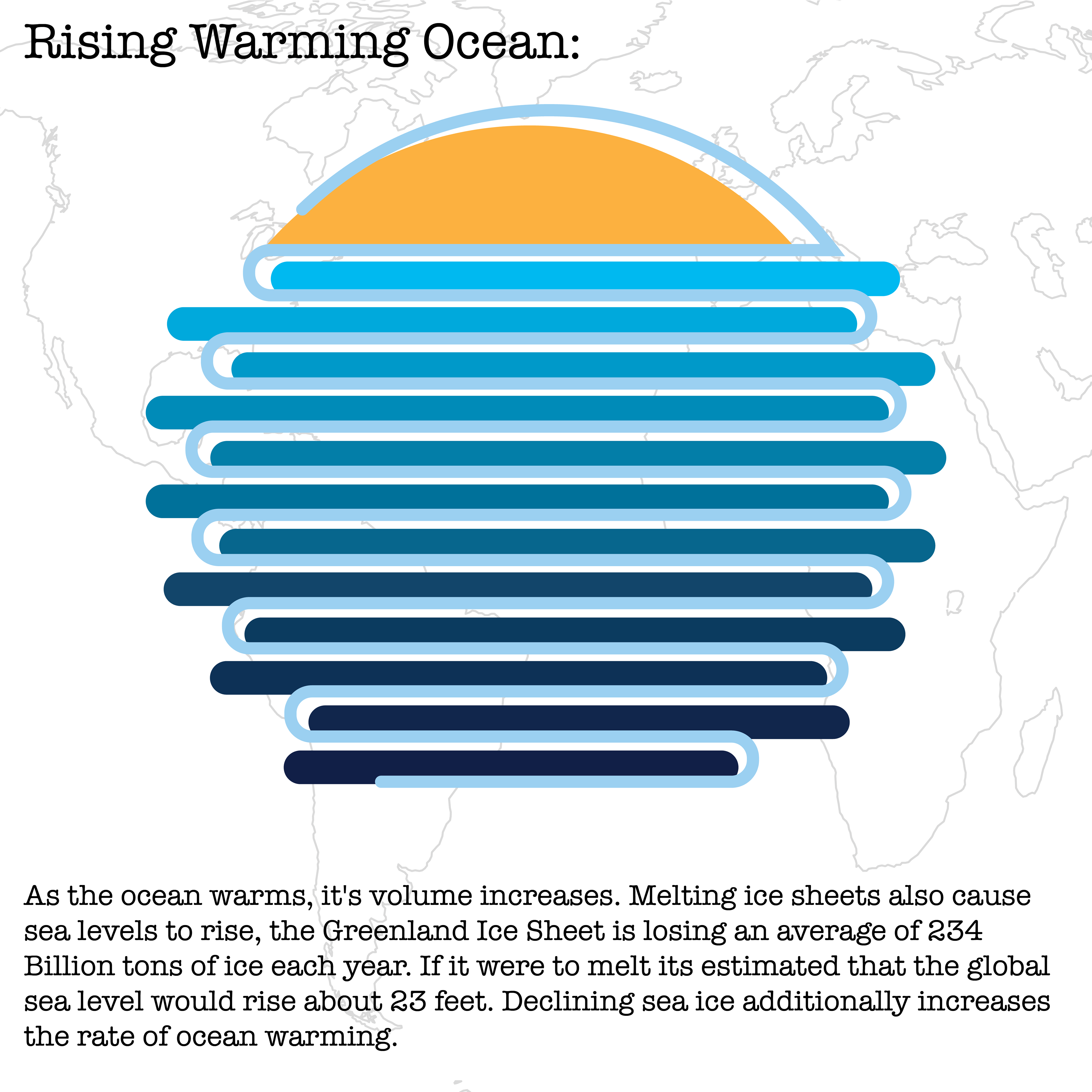
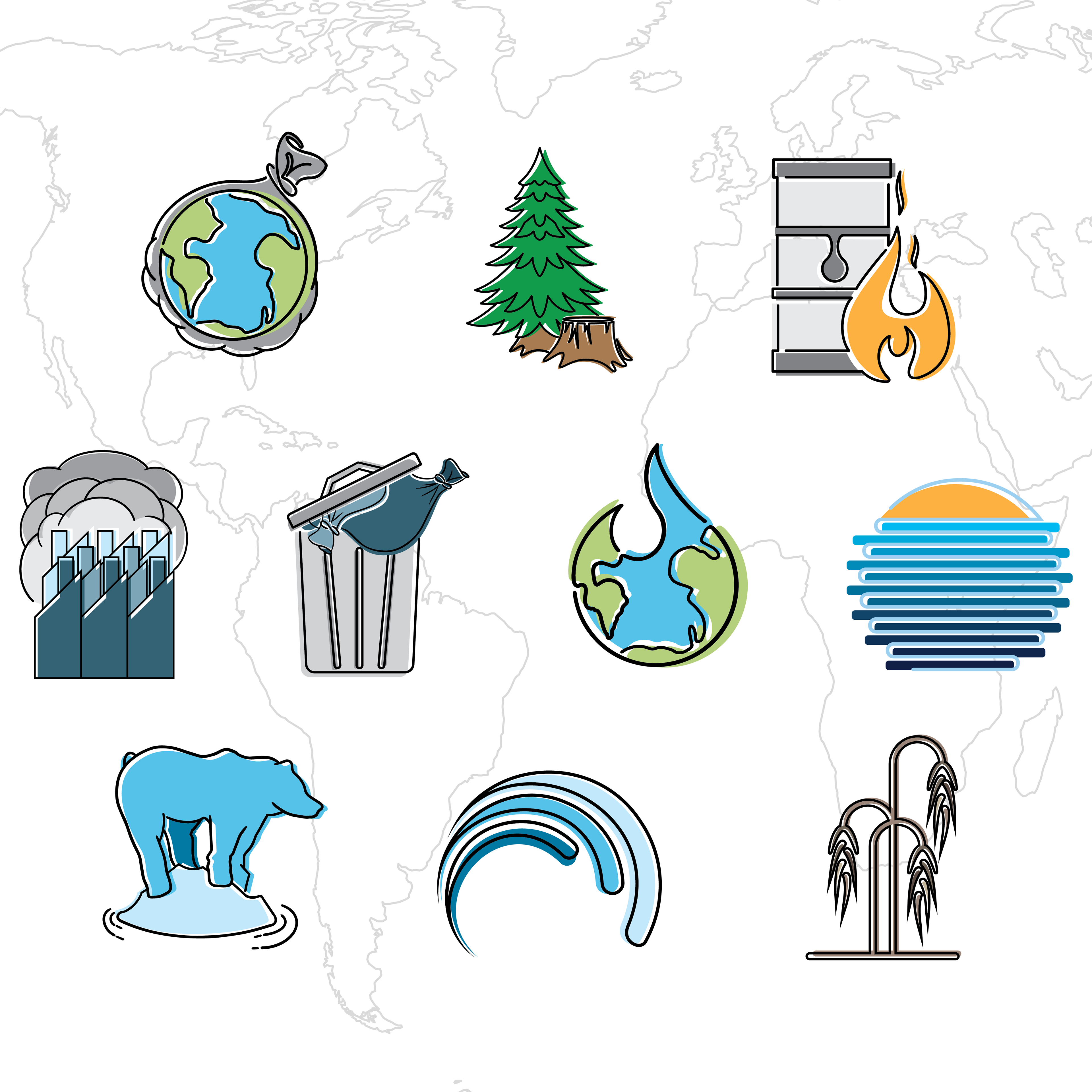
This is a set of climate change icons designed to visually communicate environmental causes and impacts through recognizable imagery. The project focused on translating research based information into an accessible visual system that could quickly communicate complex ideas through iconography.
Motivation
Climate change has become an increasingly important global issue, I wanted to explore how visual communication can make complex information more accessible. This project focused on translating research into engaging imagery that encourages awareness and understanding.
The Challenge
Climate change encompasses a broad range of interconnected topics, making information difficult to communicate clearly and effectively. The challenge was creating a cohesive icon system capable of representing multiple environmental causes and effects while remaining visually consistent, easy to understand, and immediately recognizable.
Research
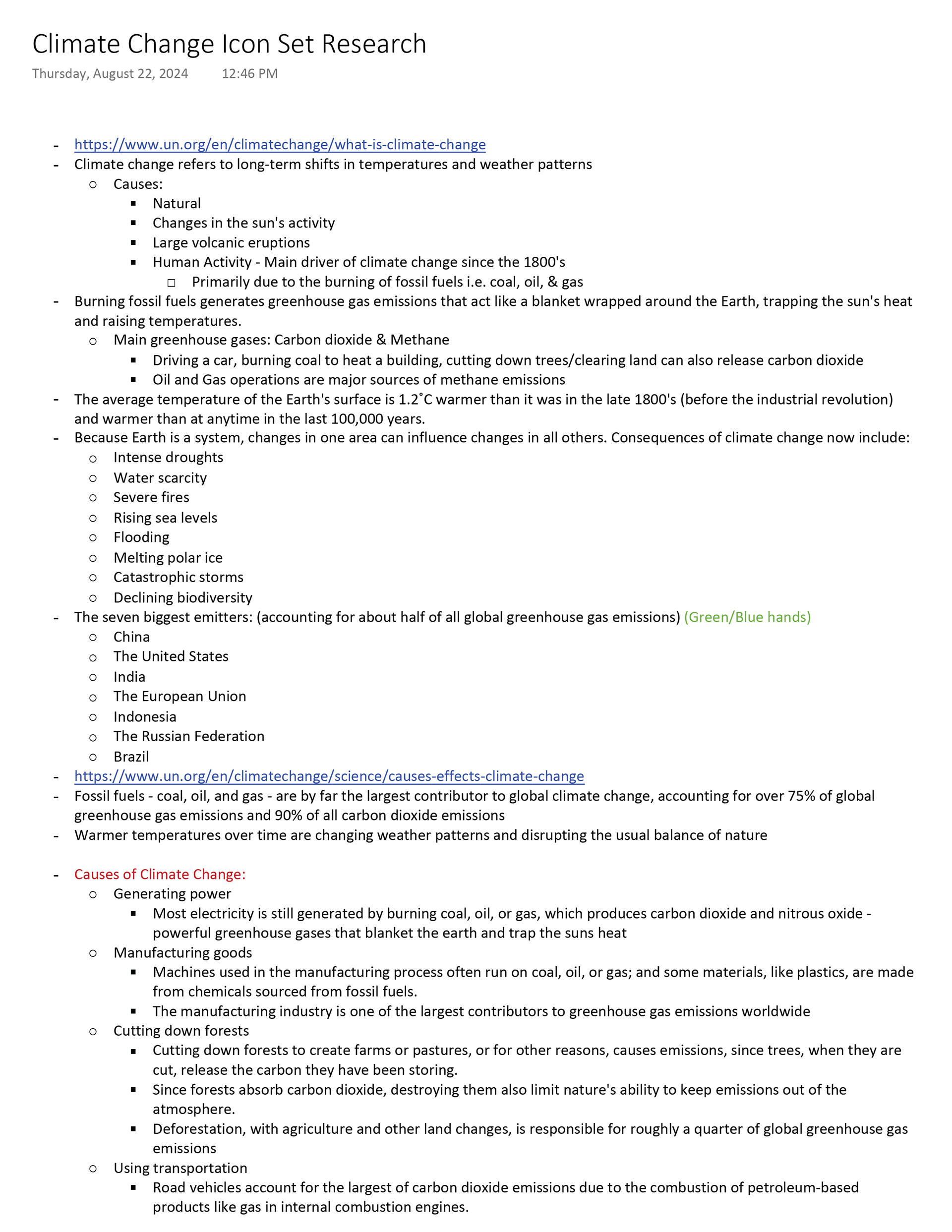
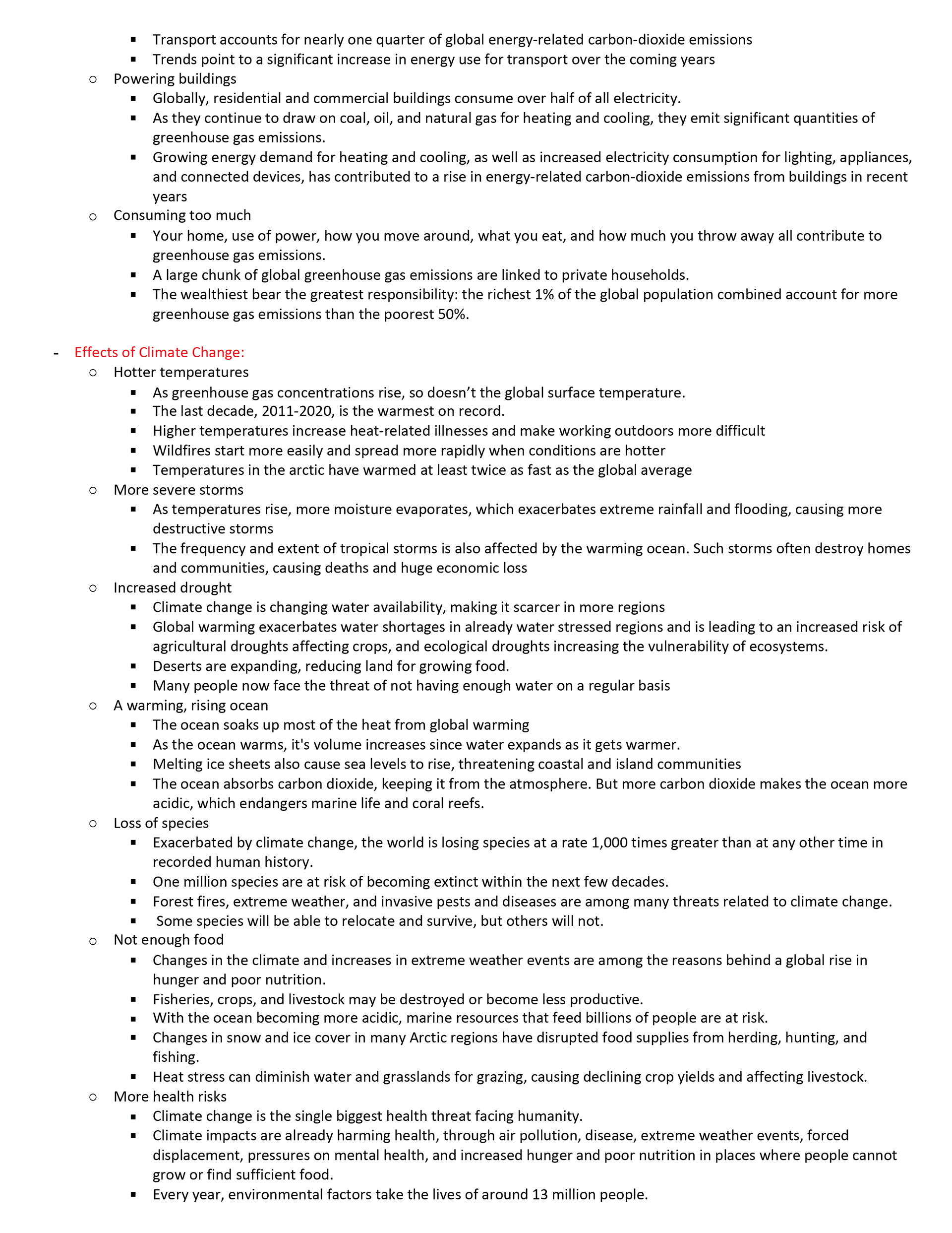
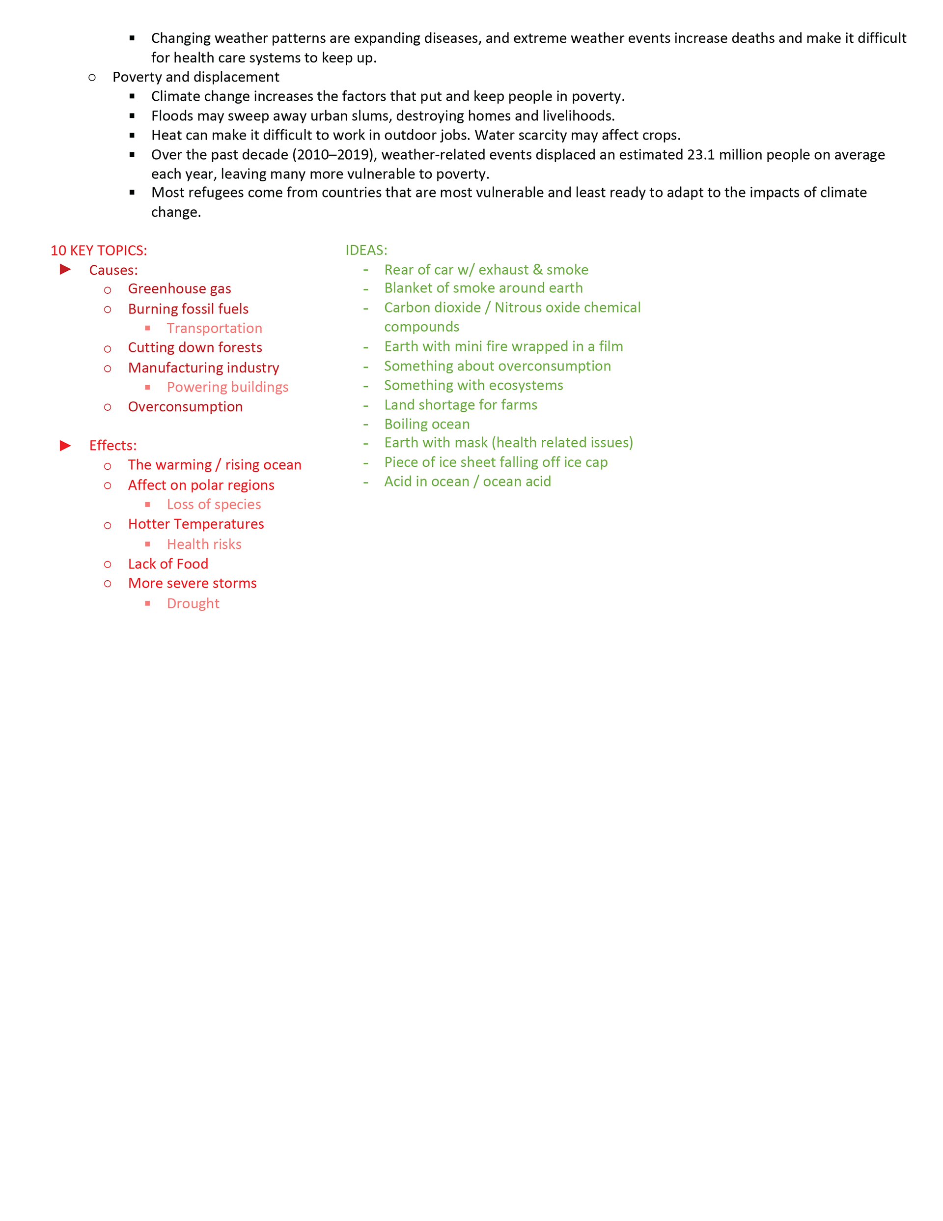
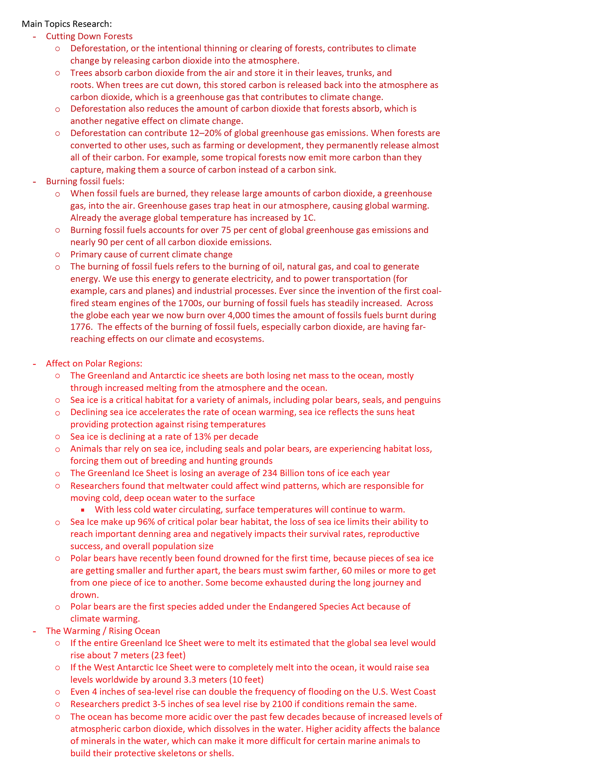
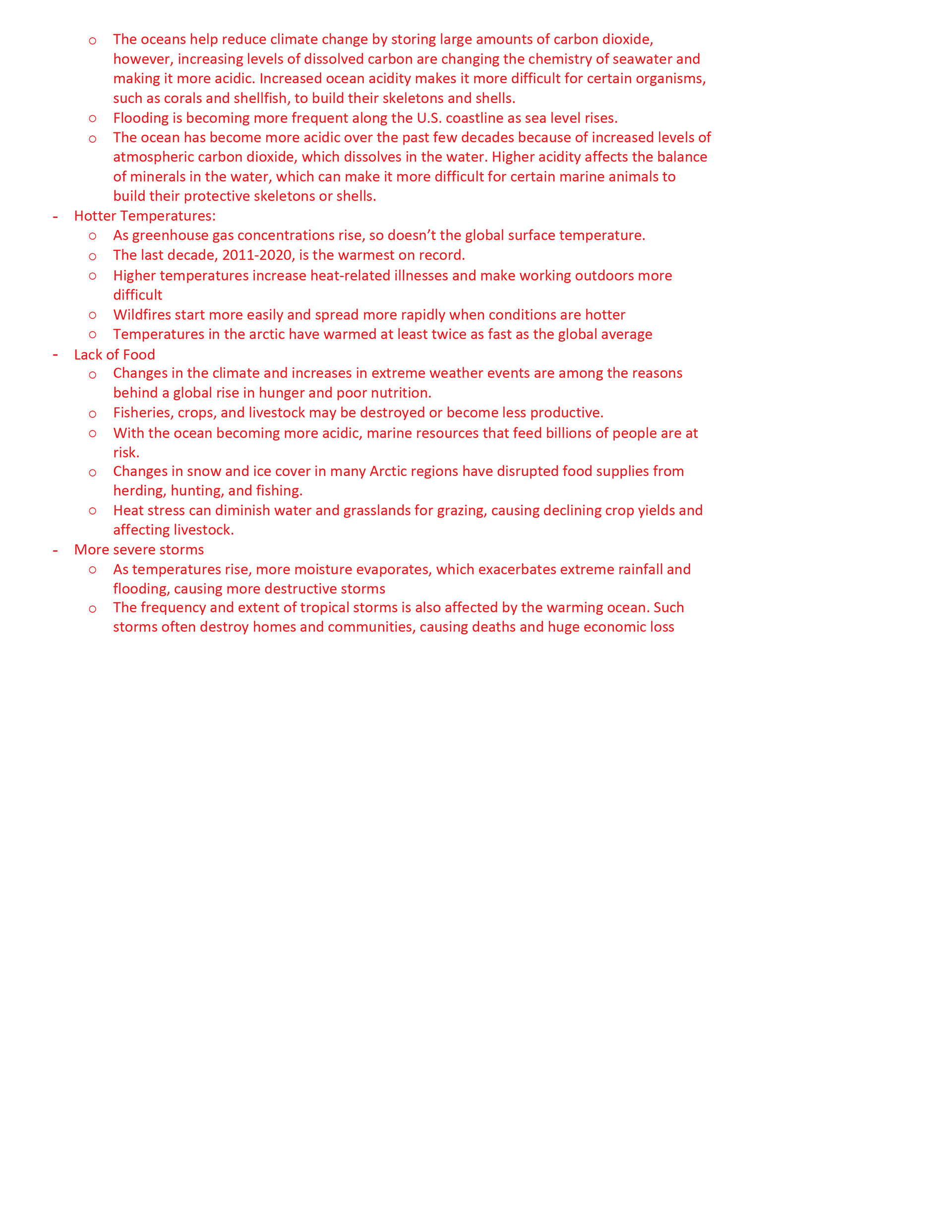
Research focused on the causes and impacts of climate change, including greenhouse gas emissions, fossil fuel consumption, deforestation, rising temperatures, habitat loss, and changing environmental conditions. Information was gathered to identify key topics that could be translated into clear visual representations while maintaining factual accuracy.
Inspiration
Visual inspiration came from contemporary icon systems and infographic design, emphasizing simplified forms, strong silhouettes, and recognizable imagery. Existing environmental graphics and informational campaigns were also considered to understand how complex concepts can be communicated through minimal visual language.
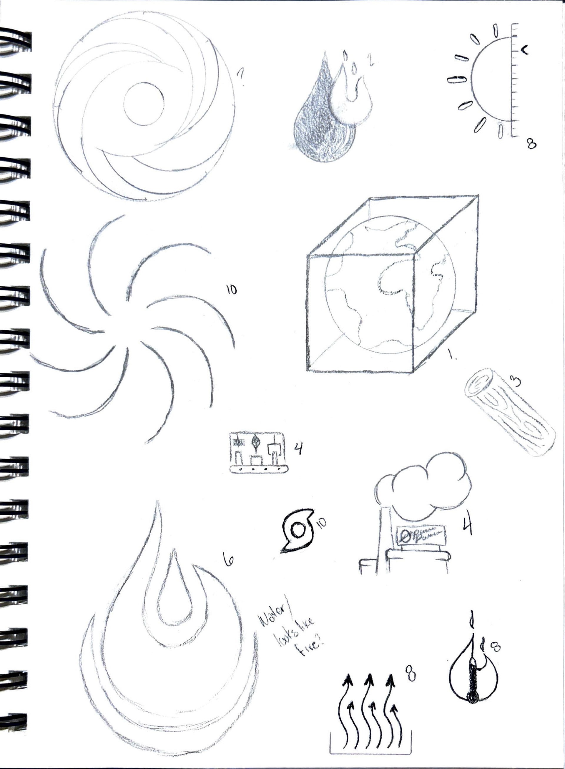
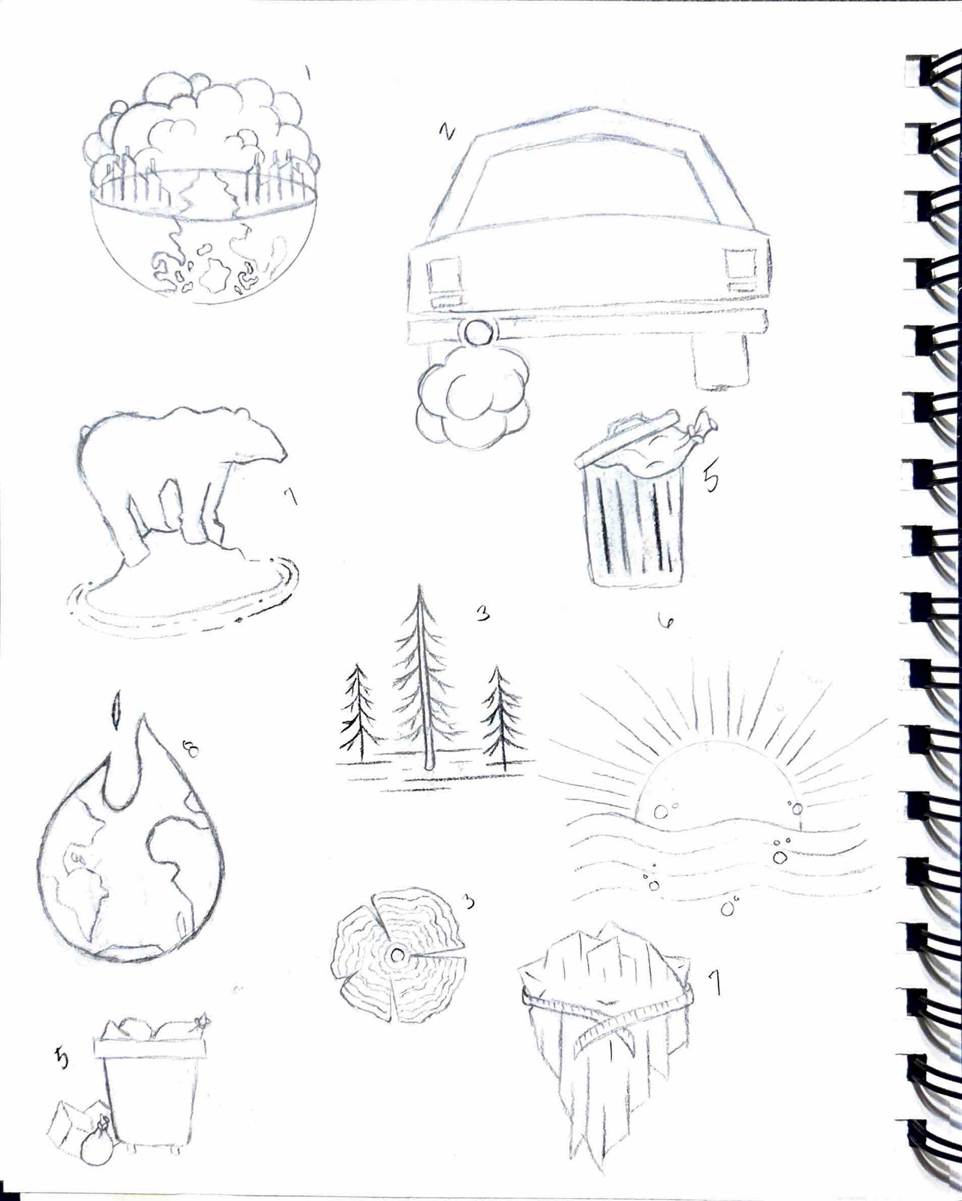
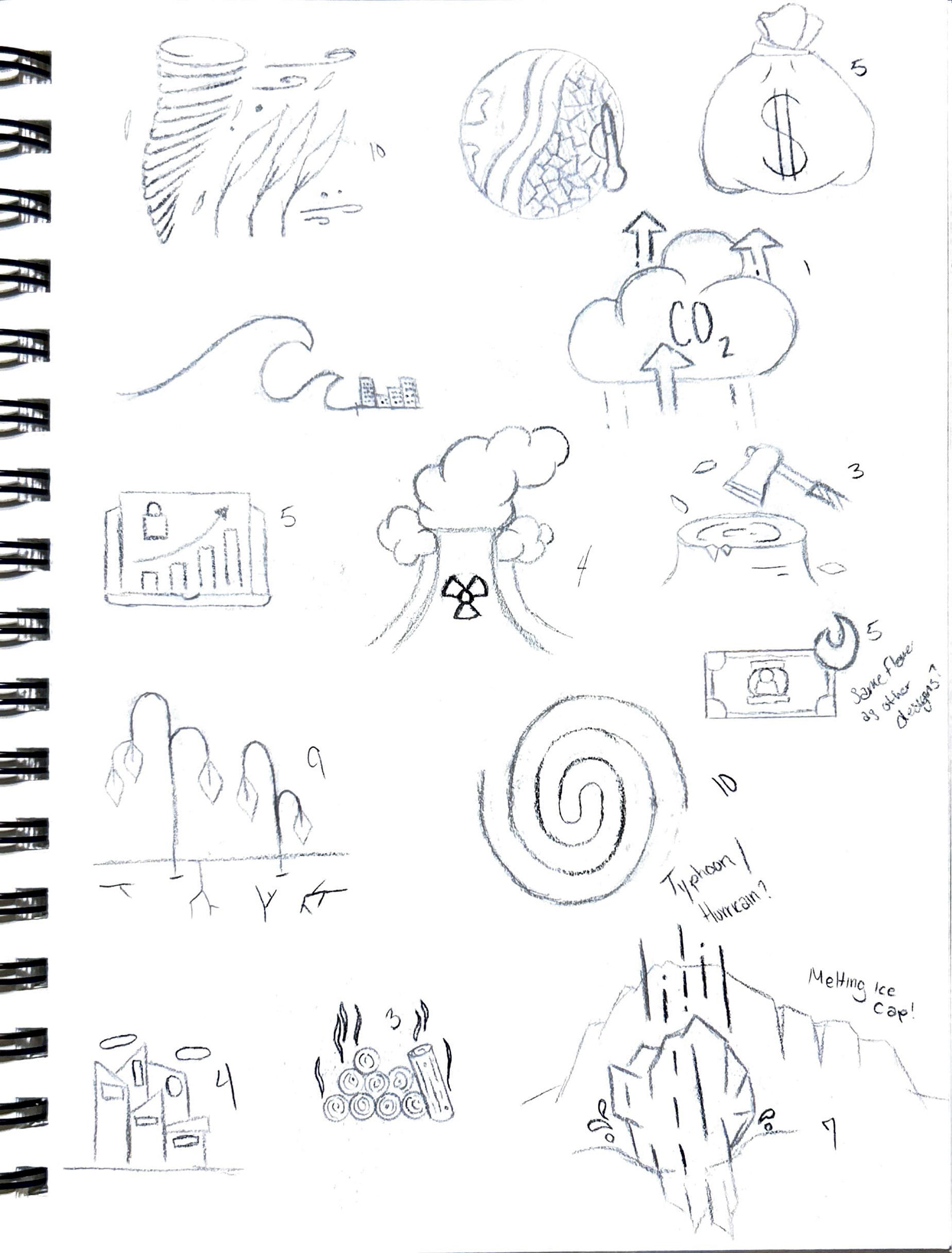
Sketches
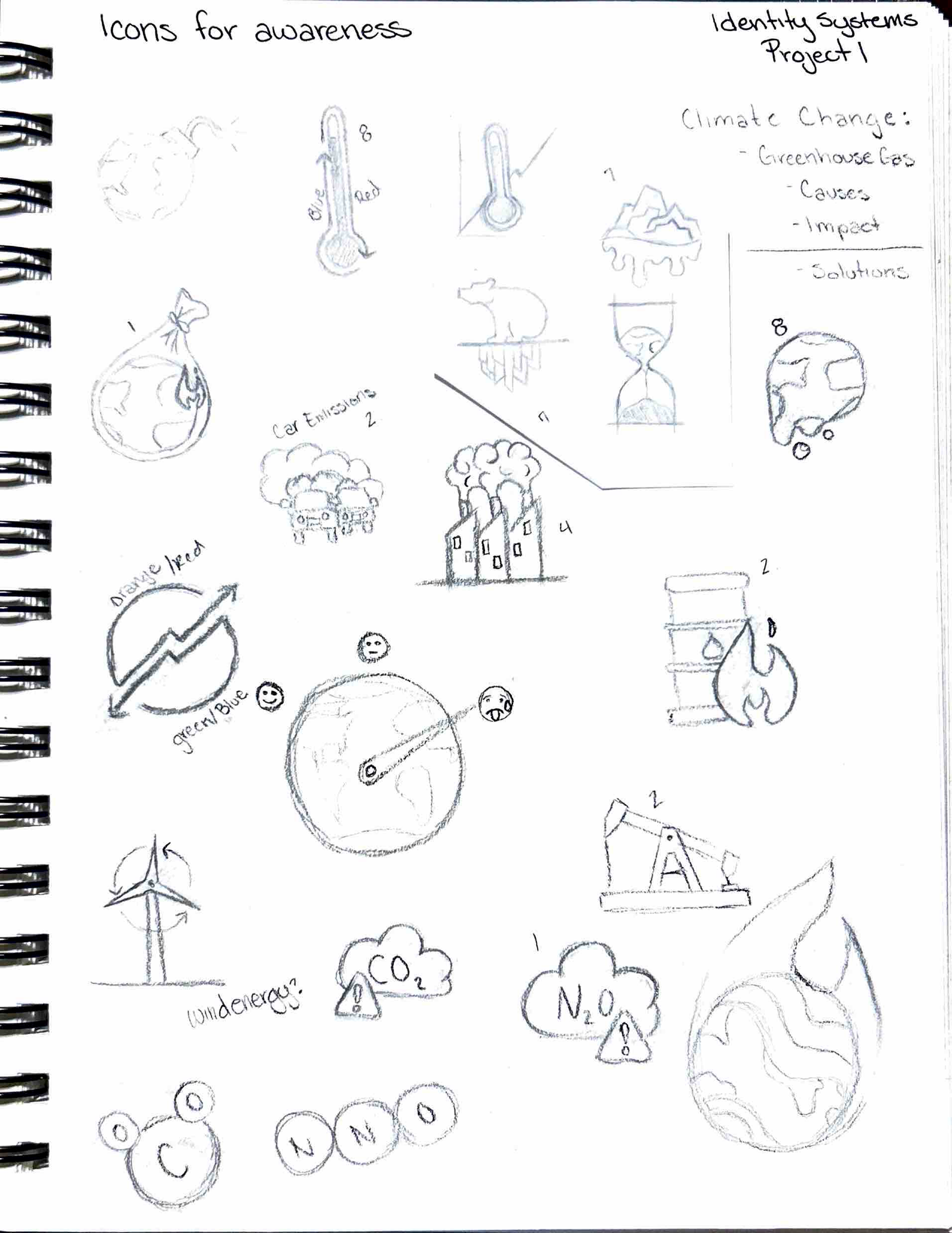
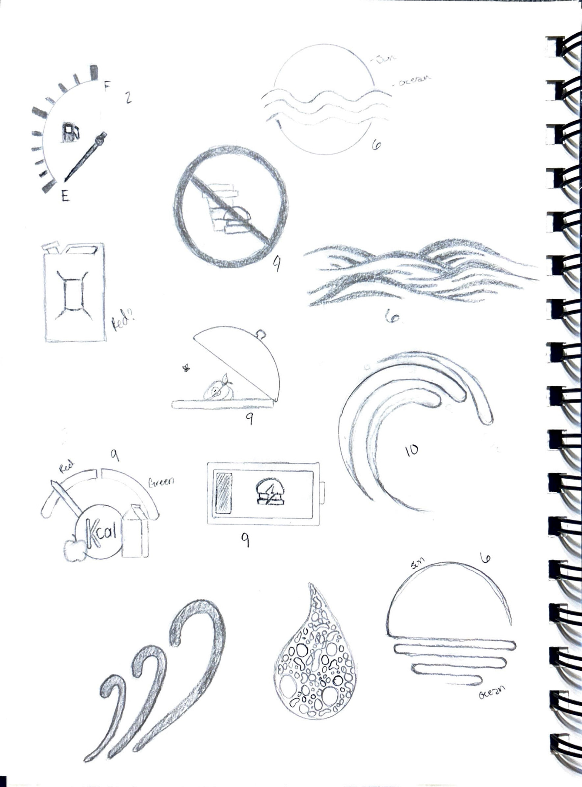
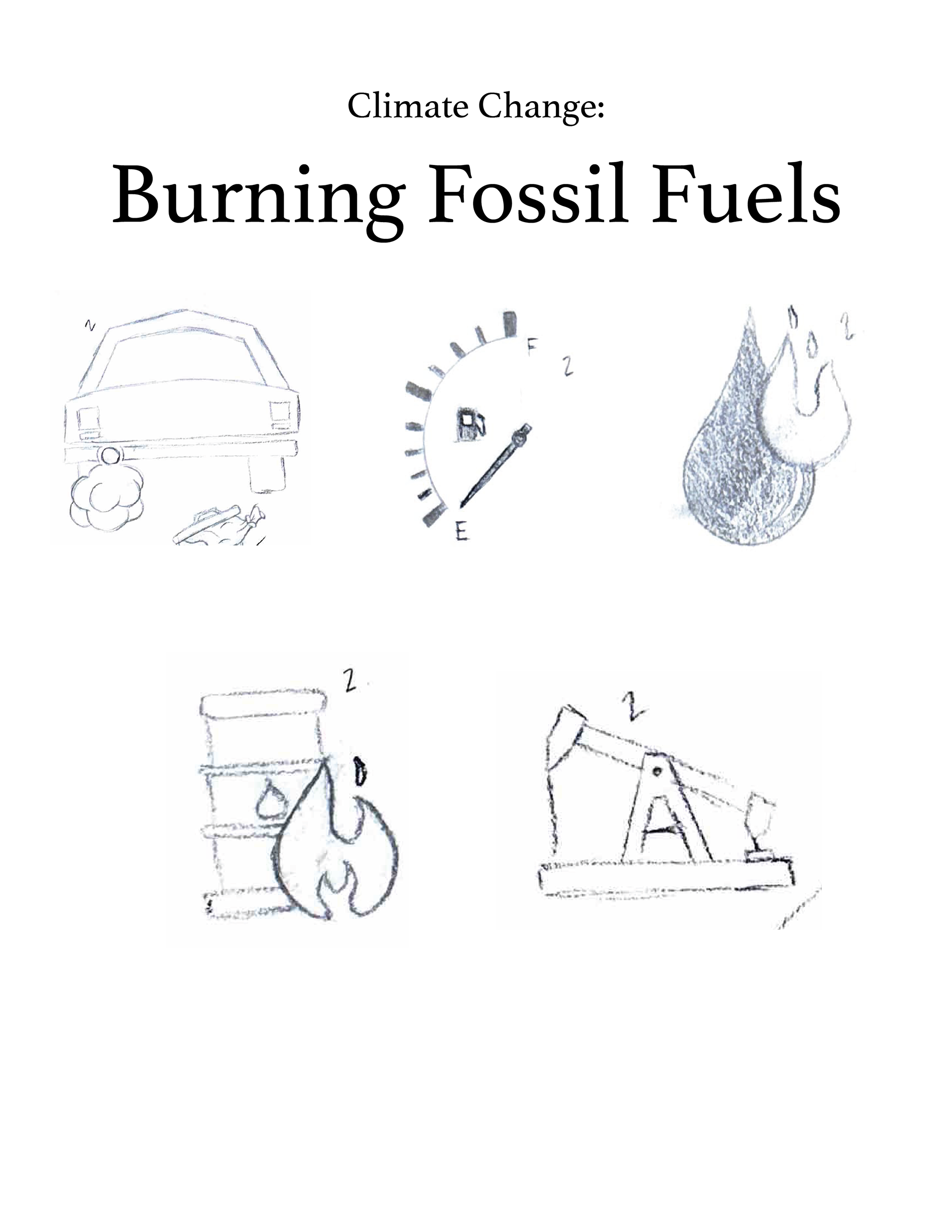
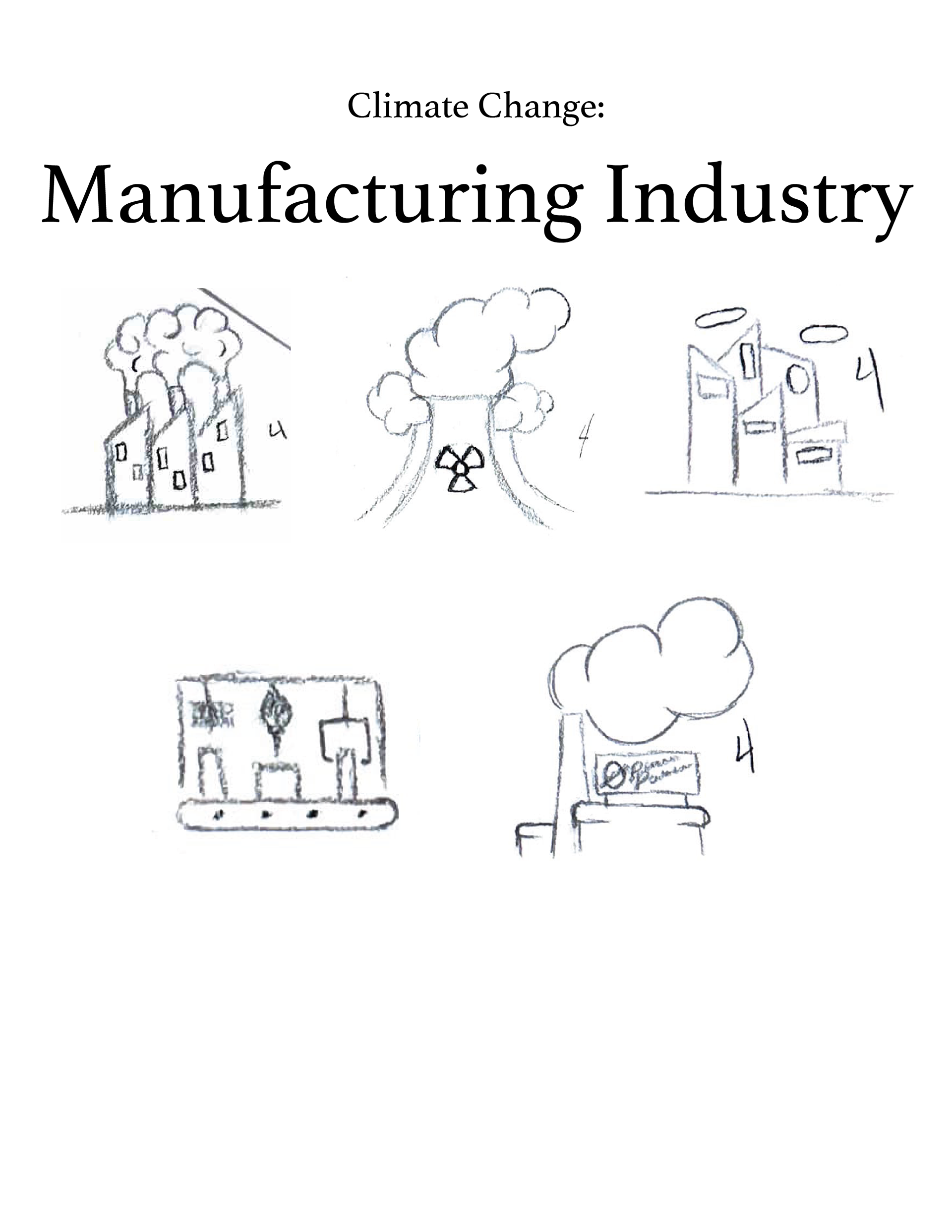
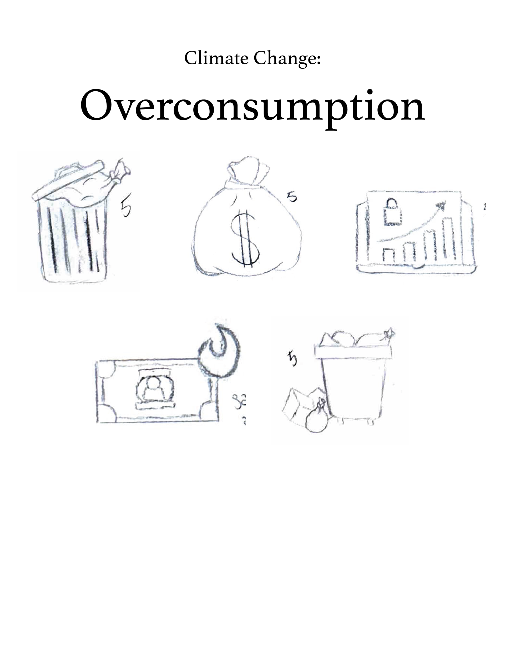
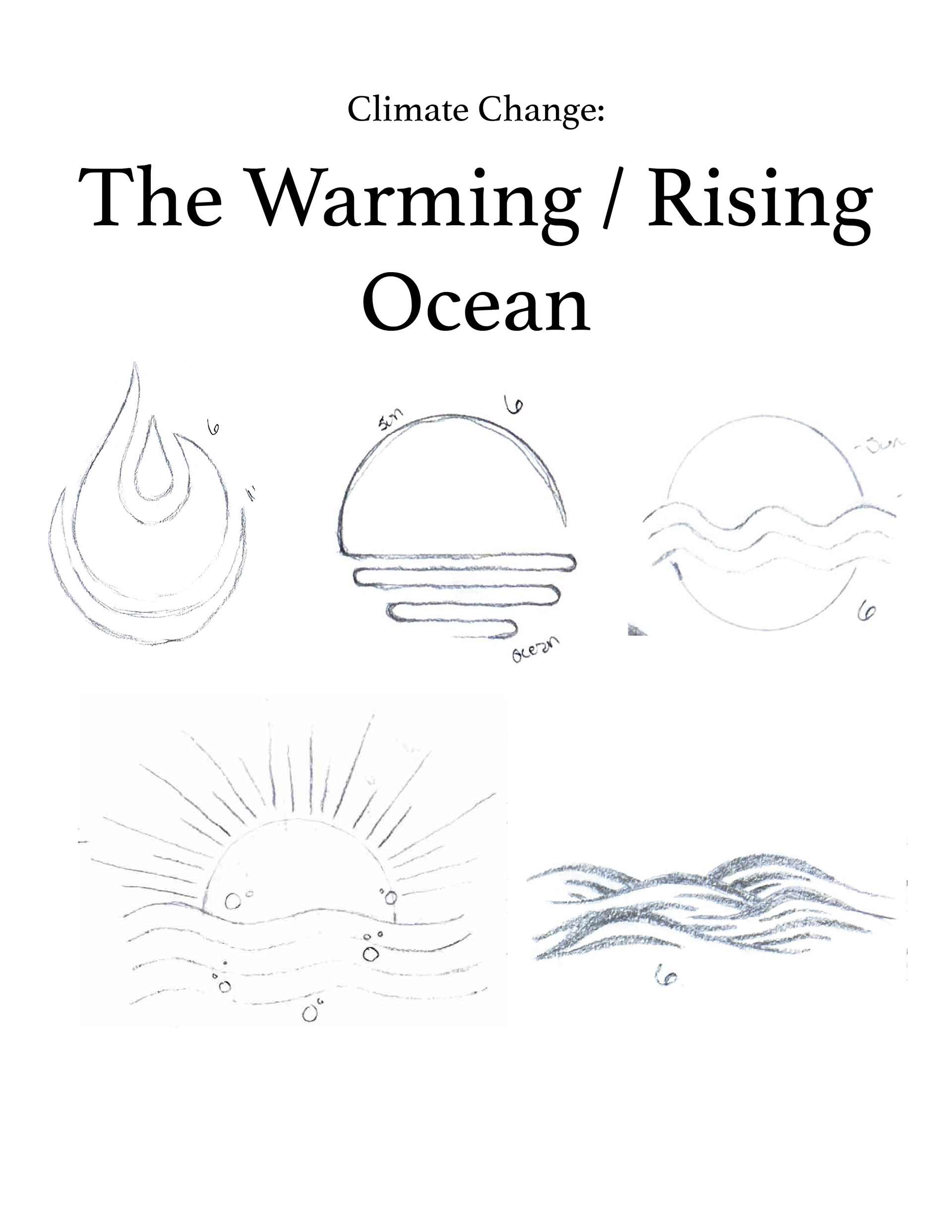
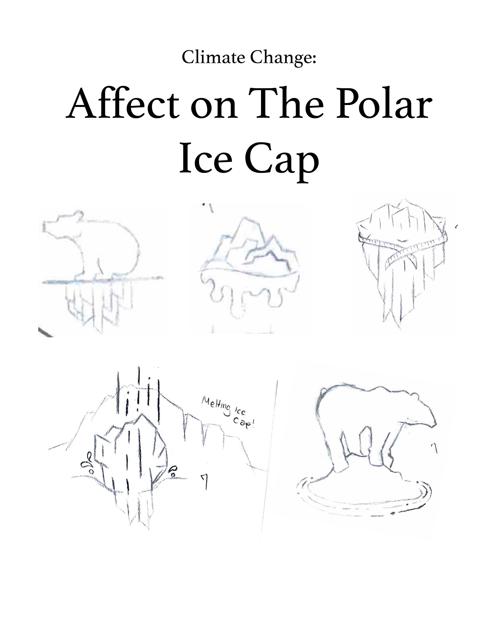
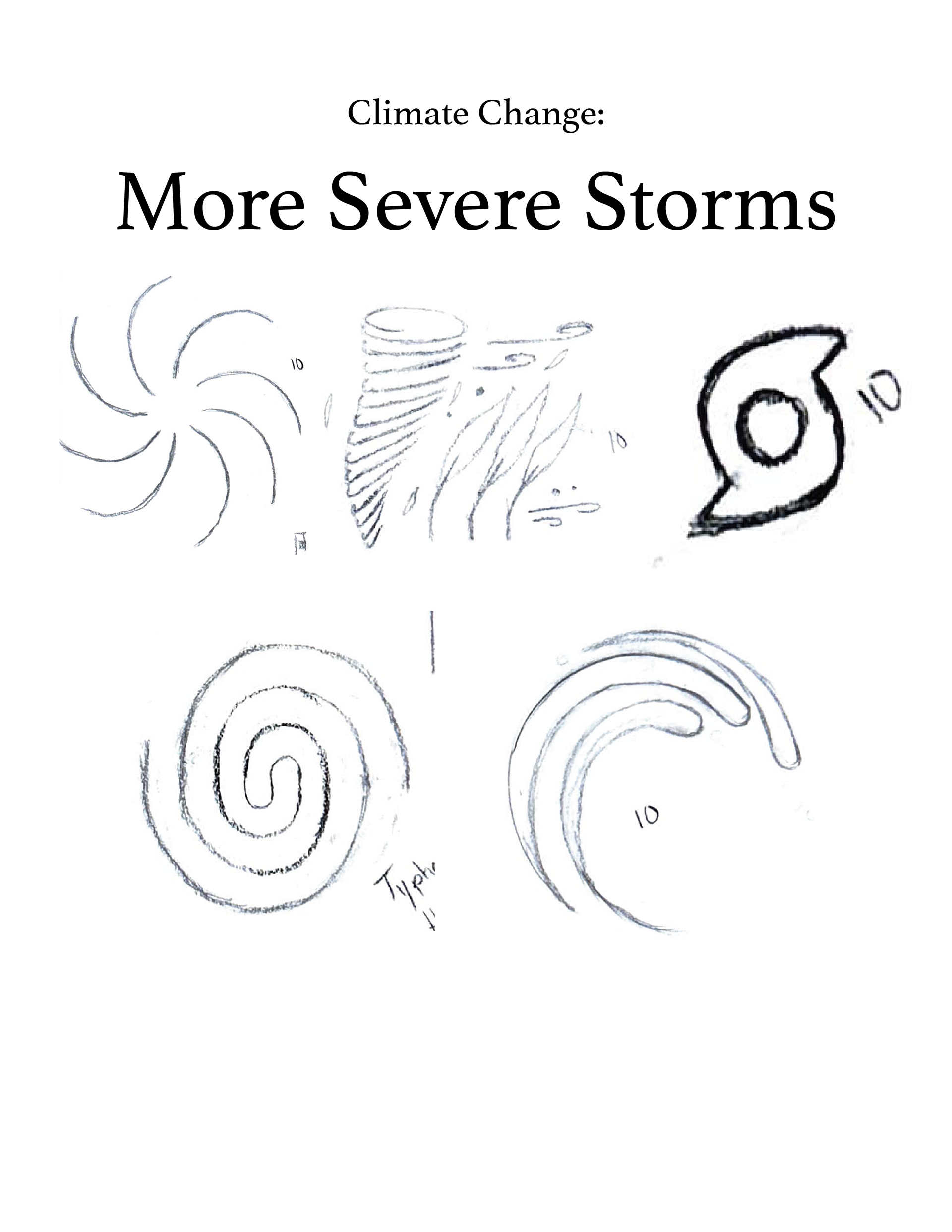
Initial sketches explored multiple methods of simplifying environmental concepts into visual symbols. Several options were experimented with at this stage to determine the strongest representations while maintaining consistency across the set.
Process
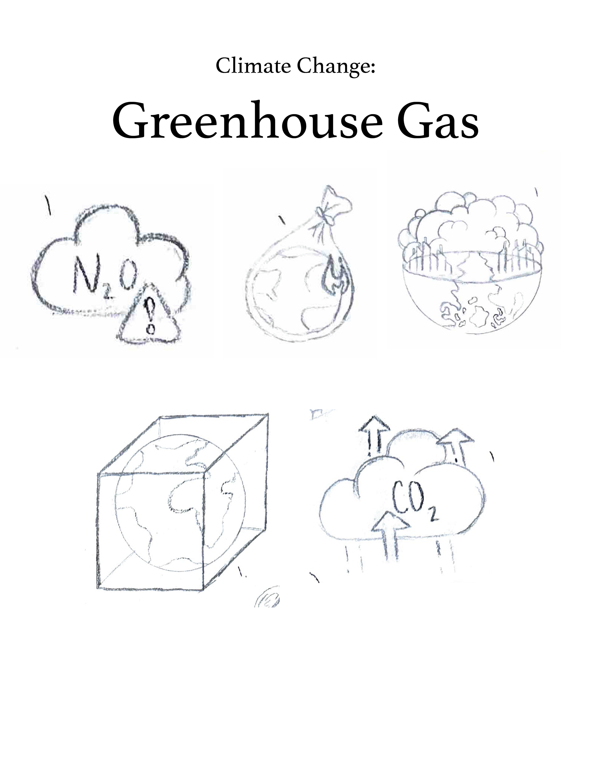
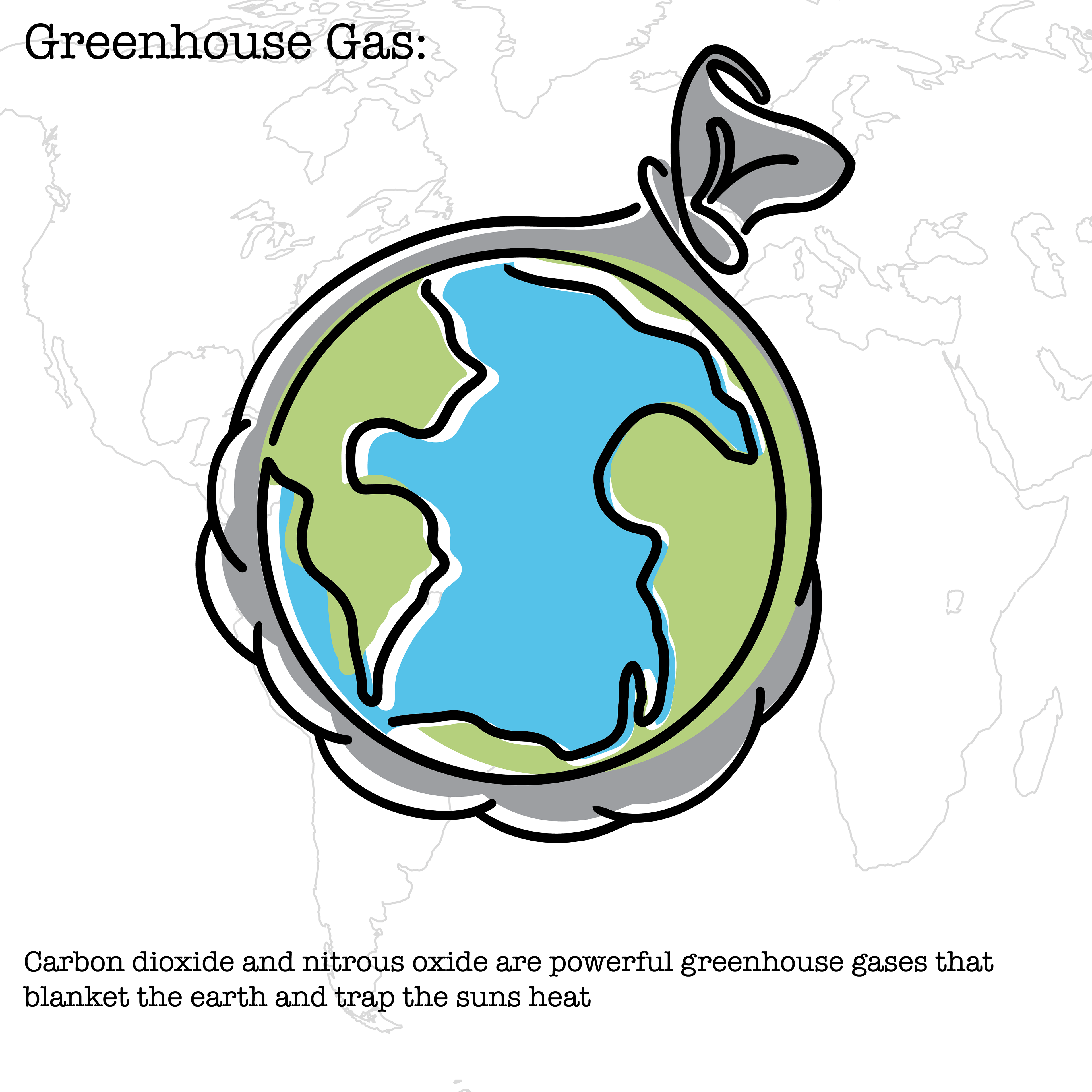
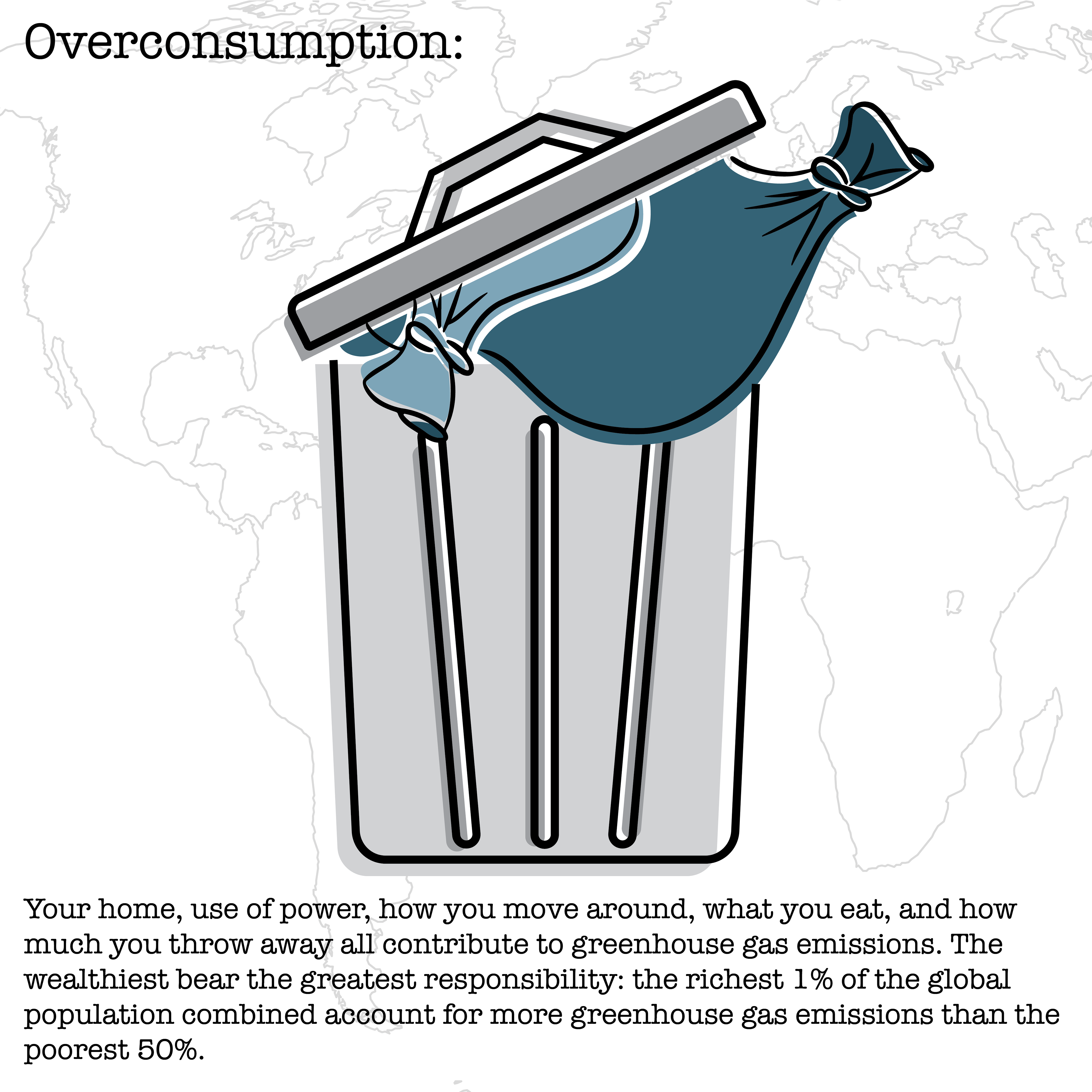
The design process involved narrowing broad climate related topics into specific categories and identifying visual metaphors for each concept. Sketches were narrowed down and refined to create a unified system through consistent line weight, color use, shape language, and overall visual hierarchy.
Purpose
The goal of this project was to create a visual communication system that increases awareness and understanding of climate related issues by presenting information in a format that is both approachable and engaging.
Key Design Aspects
• Consistent line weight and illustration style
• Simplified forms for quick visual recognition
• Environmental color palette featuring blues, greens, and environmental colors
• Use of symbolism and visual metaphors
• Cohesive icon system structure
• Clear visual hierarchy and readability
• Simplified forms for quick visual recognition
• Environmental color palette featuring blues, greens, and environmental colors
• Use of symbolism and visual metaphors
• Cohesive icon system structure
• Clear visual hierarchy and readability
Outcome
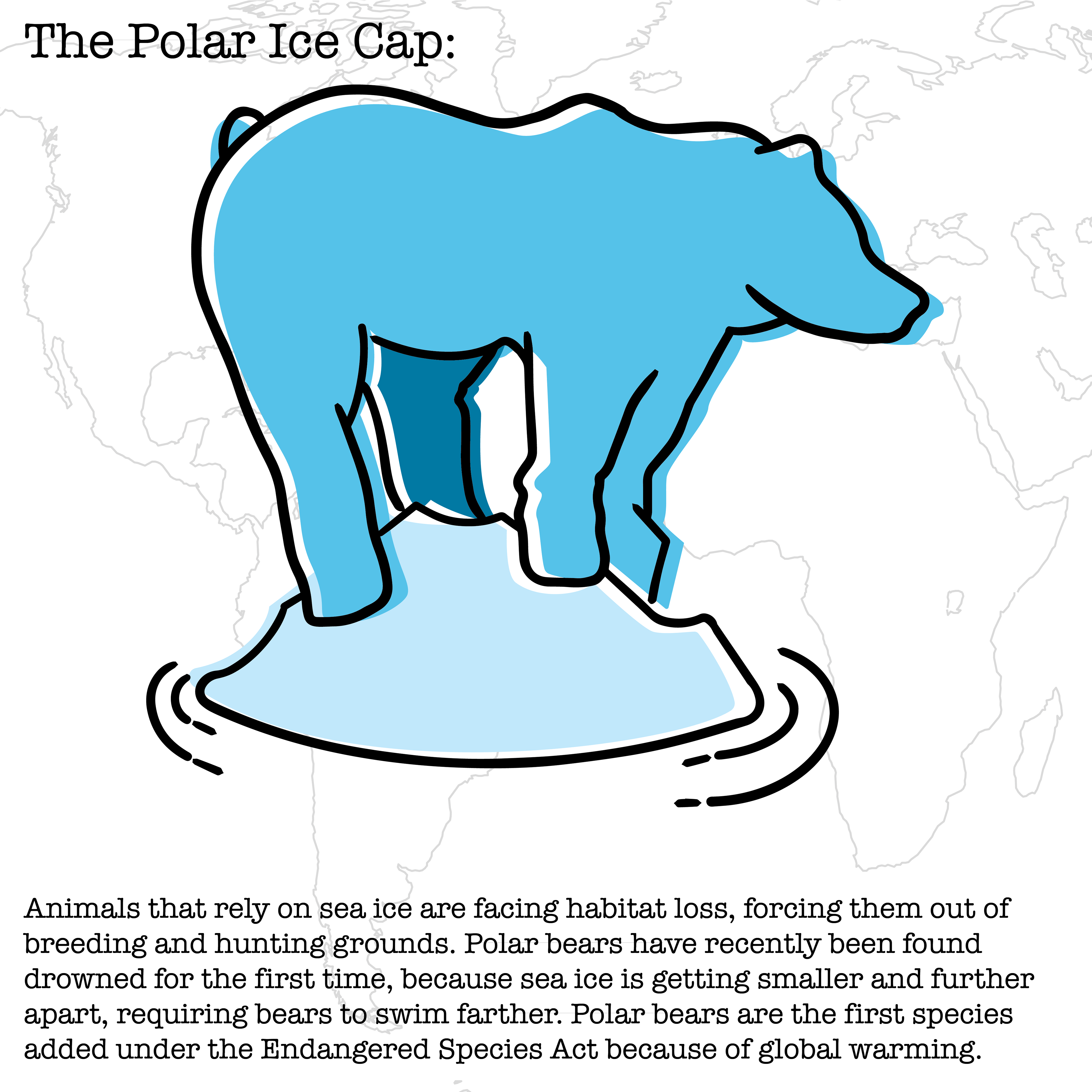
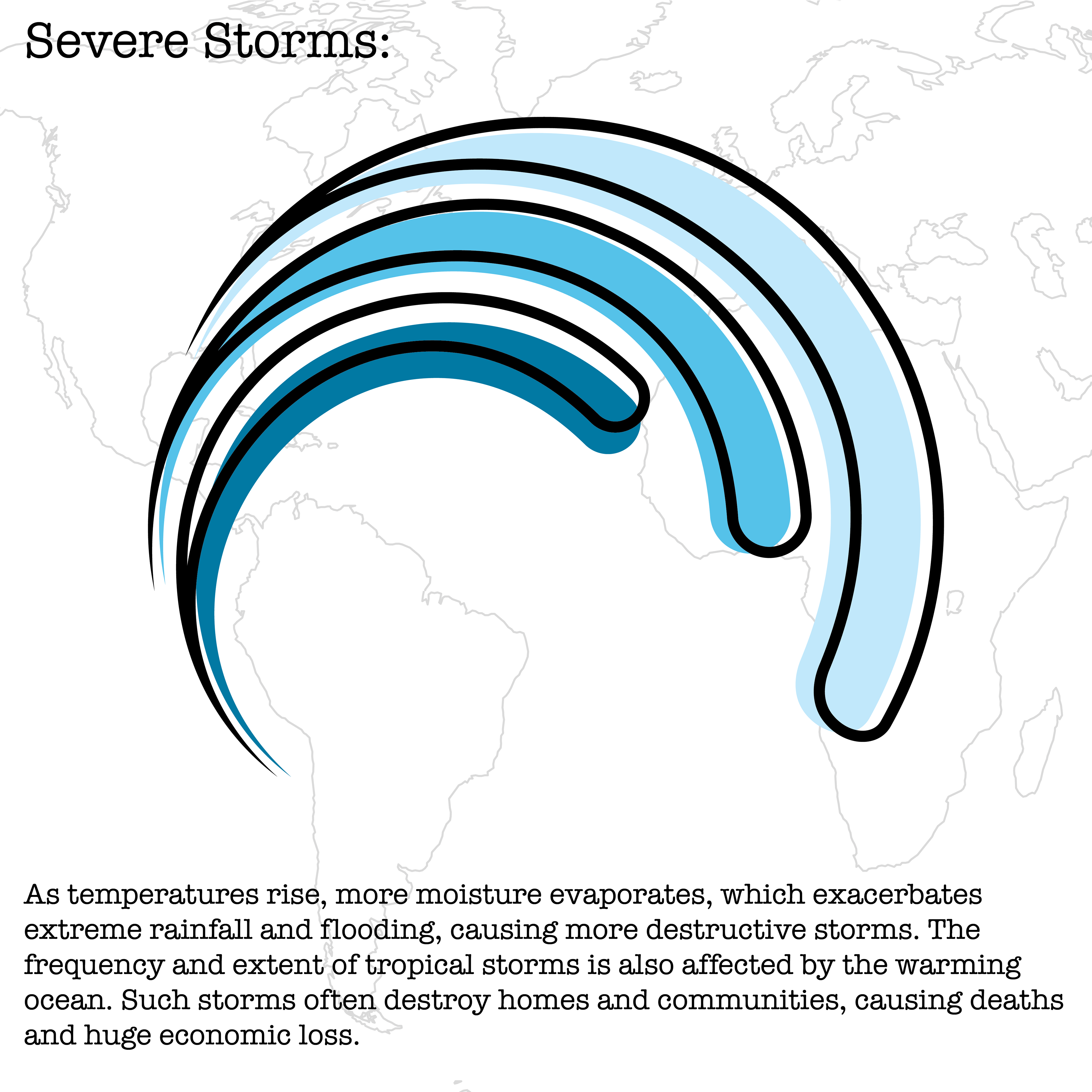
The final icon set successfully transformed research heavy information into a cohesive visual system capable of communicating multiple environmental topics quickly and effectively. This project strengthened my ability to translate complex concepts into simplified visual solutions while maintaining consistency across a larger design system.
References
United Nations. (n.d.). What is climate change?. United Nations. https://www.un.org/en/climatechange/what-is-climate-change
United Nations. (n.d.-a). Causes and effects of climate change. United Nations. https://www.un.org/en/climatechange/science/causes-effects-climate-change