This was a personal branding project focused on creating a visual identity that represents my personality, design approach, and professional goals. The project explored how typography, color, and symbolism could be combined to create a memorable and authentic brand I still use today.
Motivation
As a designer, I wanted to create a brand identity that felt personal while remaining professional and adaptable. This project challenged me to reflect on my creative style and how I wanted to present myself as both a designer and an individual.
The Challenge
Creating a personal brand requires balancing individuality with professionalism. The challenge was developing a visual identity that felt unique to me while remaining versatile enough to function across business cards, digital platforms, and future portfolio materials.
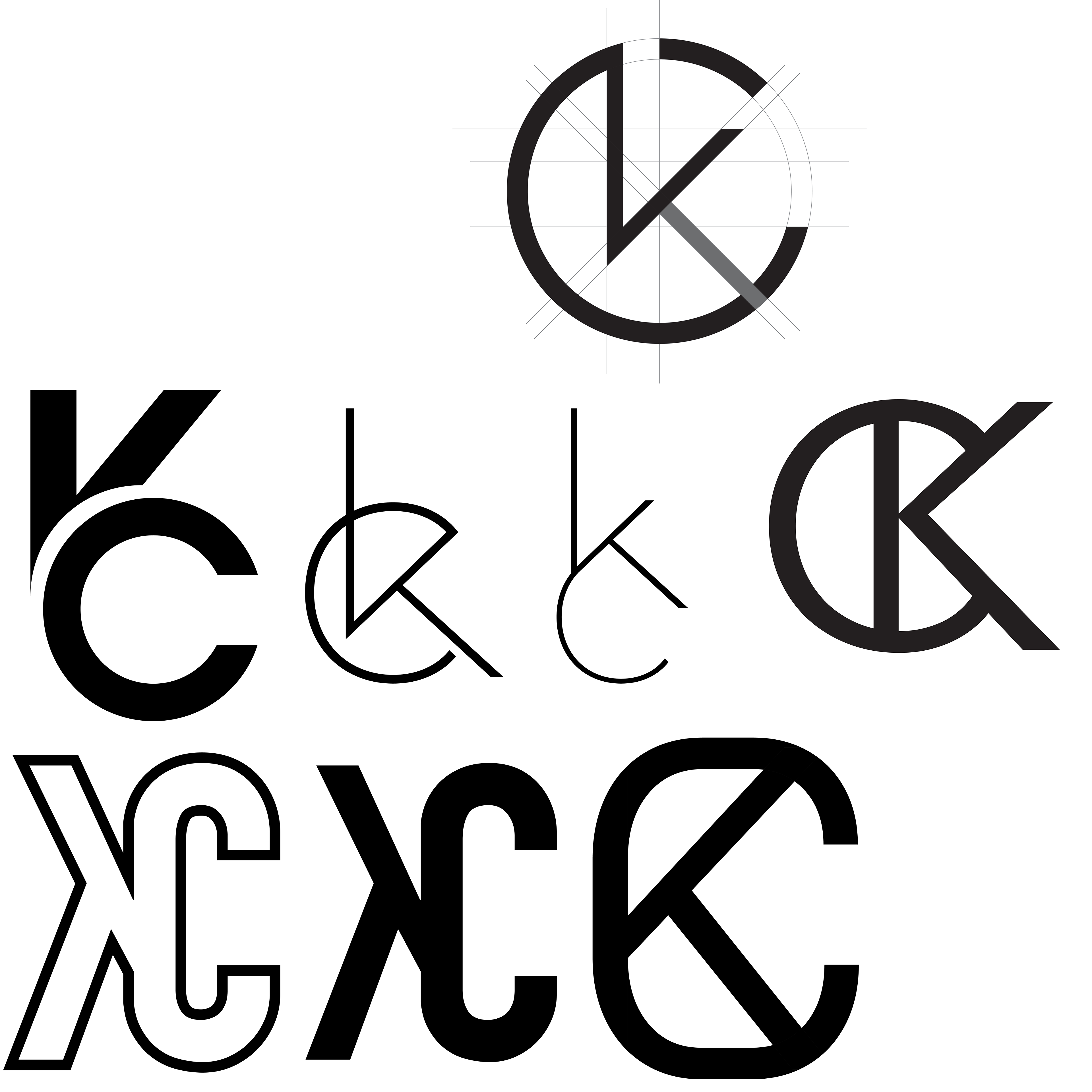
First Iterations
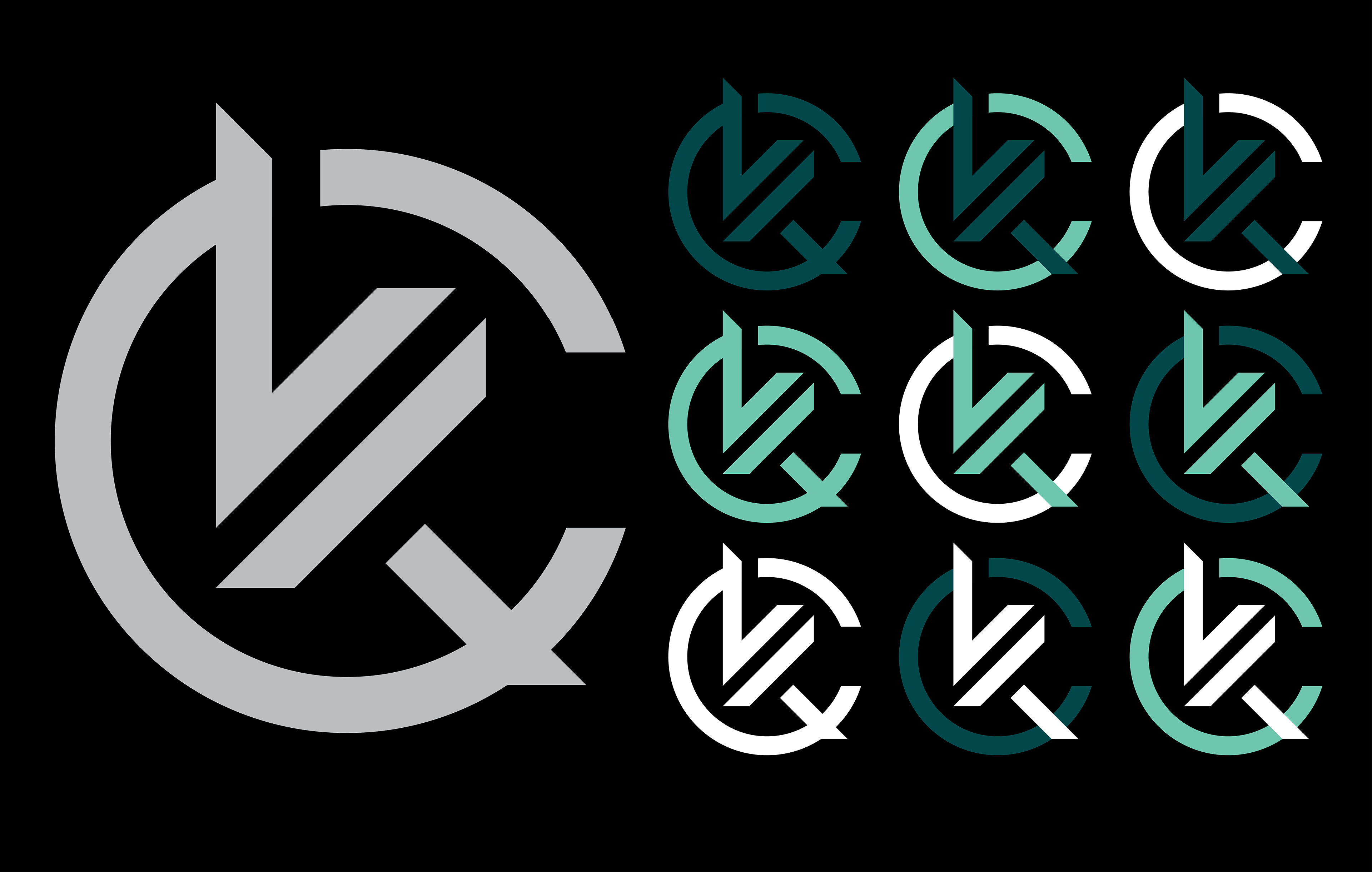
Initial concepts explored various ways of combining my initials into a recognizable logo mark. Multiple arrangements, letterform styles, and levels of abstraction were tested to determine how the identity could communicate both personal meaning and visual clarity.
Process
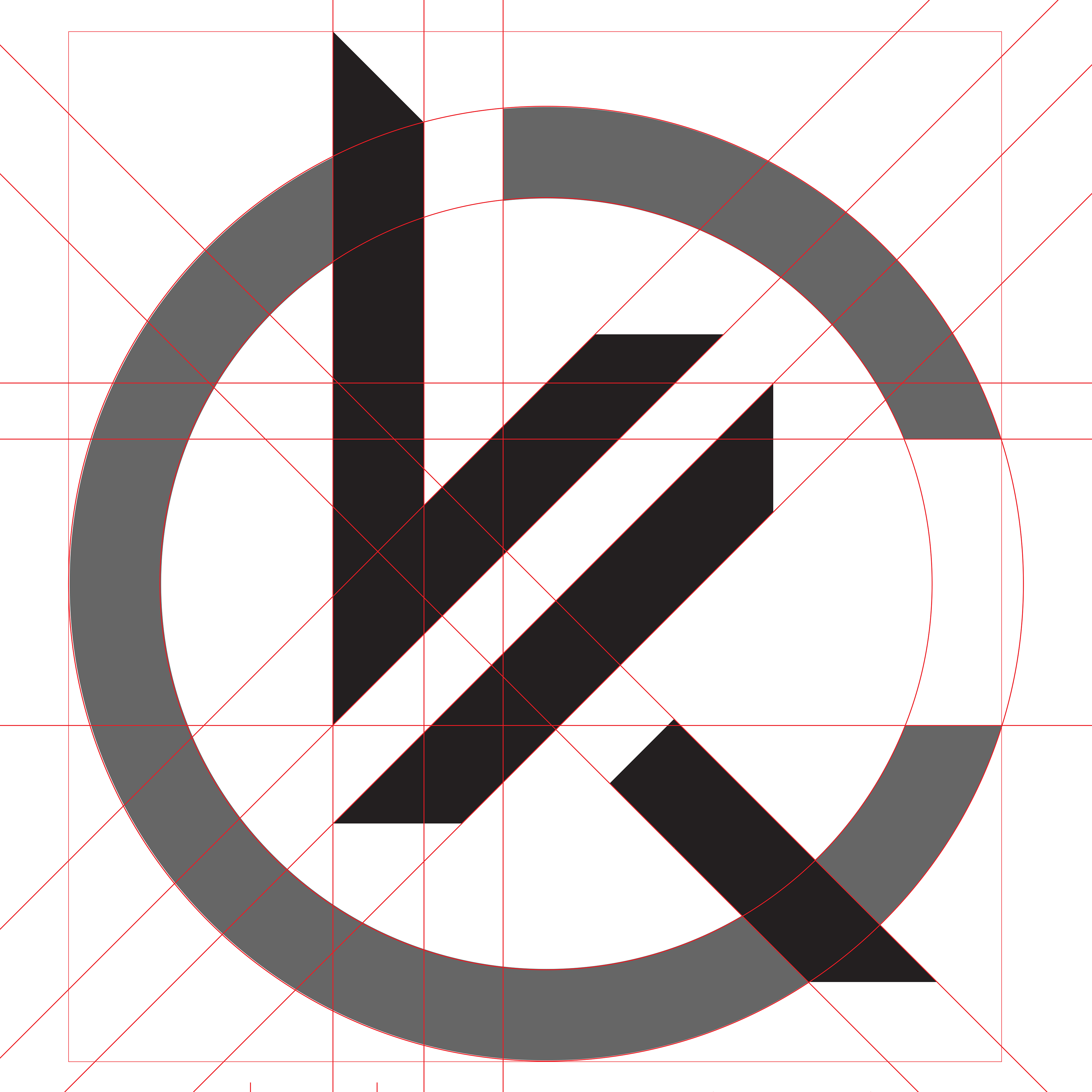
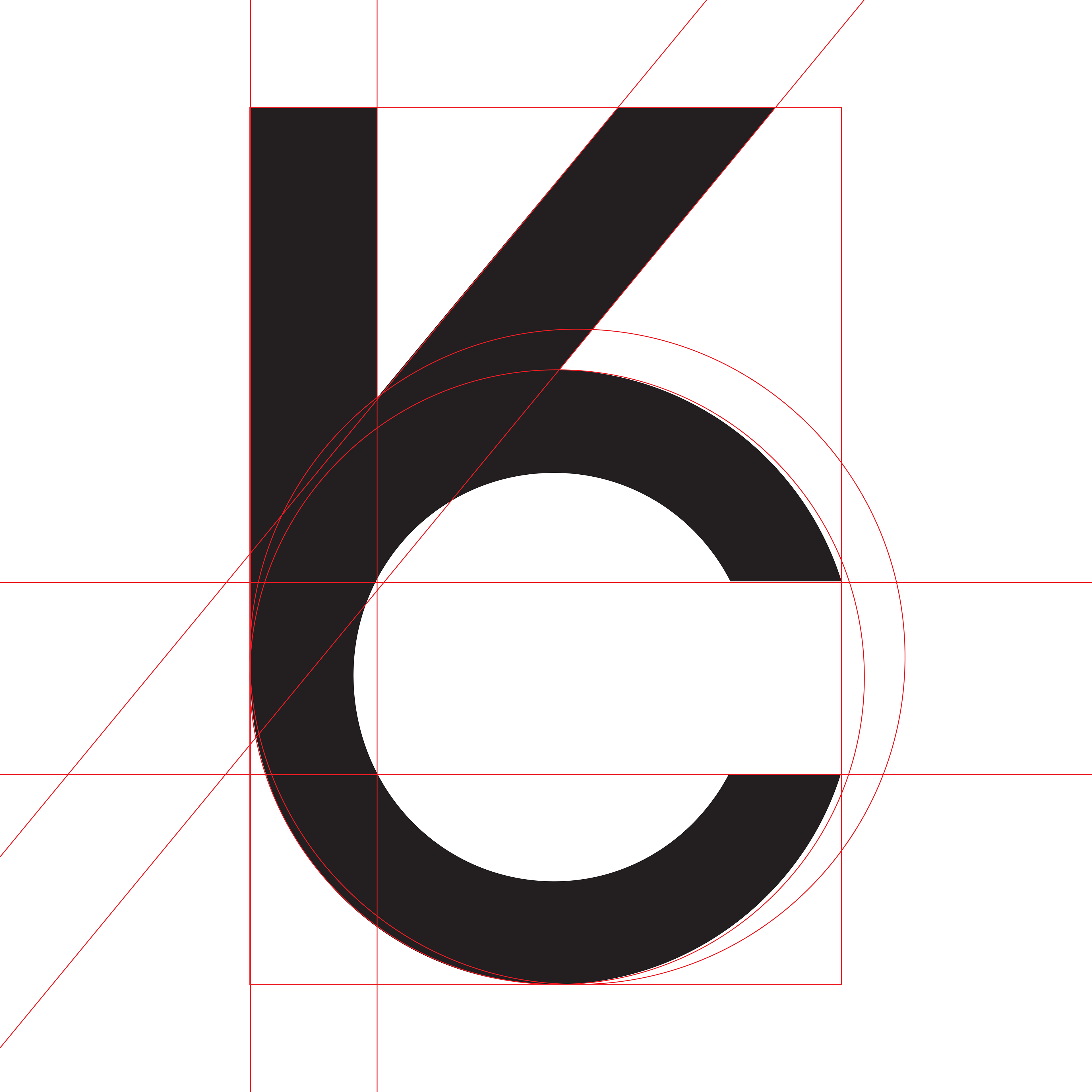
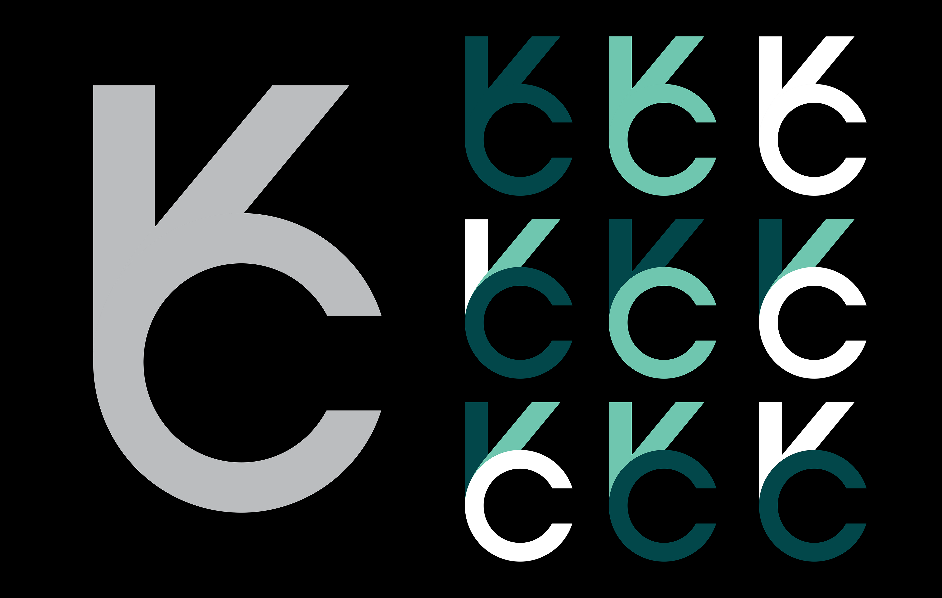
From the beginning iterations, I decided to expand upon two of the original ideas, refining the forms and fixing angles and curves.
The design process focused on refining the relationship between the letterforms and identifying opportunities for symbolism within the mark.
Through experimentation and iteration, the logo evolved from a simple monogram into a more intentional symbol that represented both my initials and a broader sense of communication and connection.
Color Exploration
Exploring color centered around a palette of black, white, teal, and dark green. These colors were selected to create a balance between professionalism and creativity while providing strong contrast and flexibility across different applications. The combination allowed the identity to feel modern, approachable, and visually distinctive.
Key Design Aspects
• Custom "M" logo inspired by mountain forms
• Community centered branding strategy
• Nature inspired and energetic color palette
• Typography pairing balancing history and modernity
• Brand applications across multiple formats
• Audience focused visual communication
• Stakeholder driven design decisions
• Community centered branding strategy
• Nature inspired and energetic color palette
• Typography pairing balancing history and modernity
• Brand applications across multiple formats
• Audience focused visual communication
• Stakeholder driven design decisions

Outcome
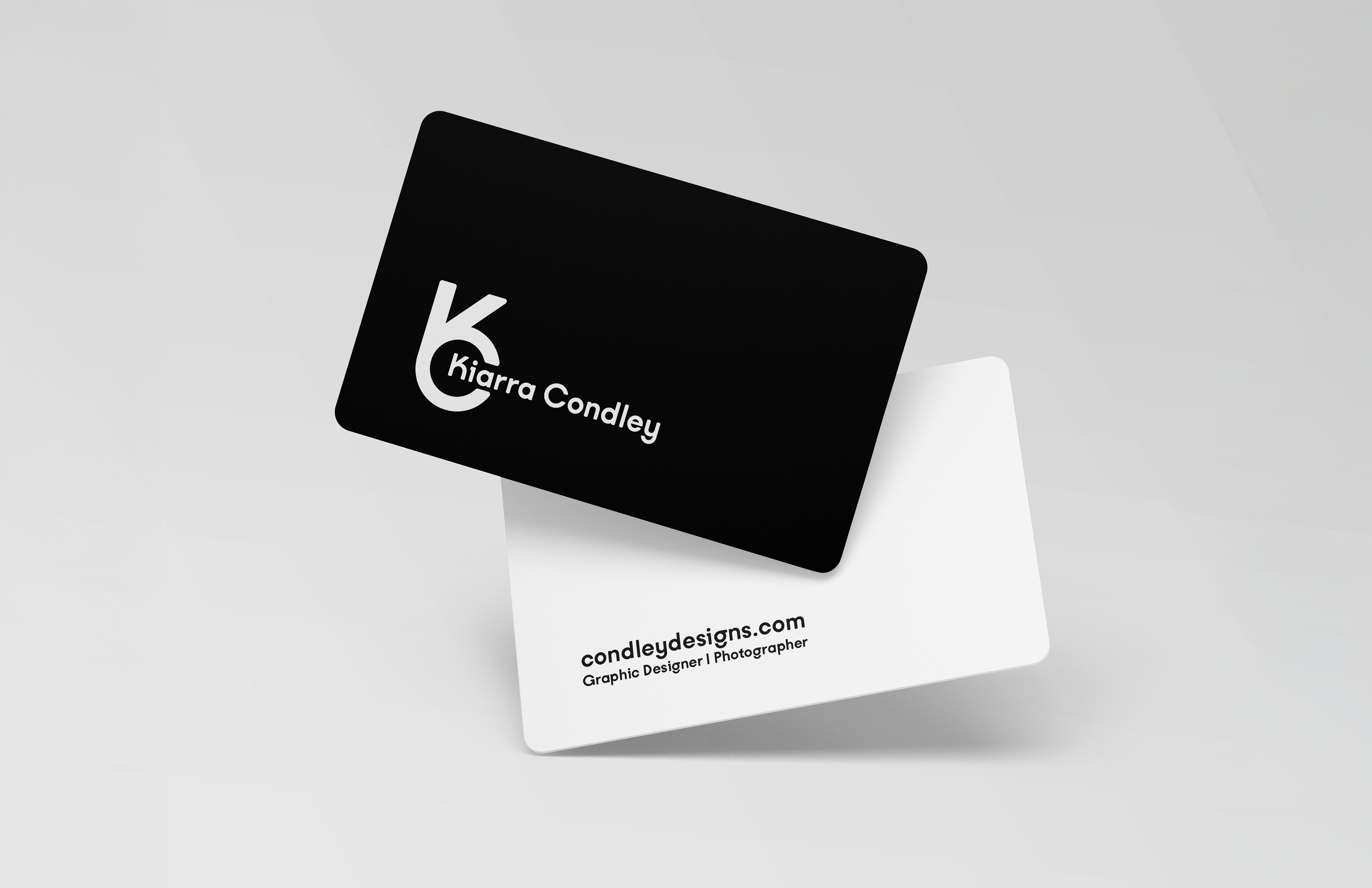
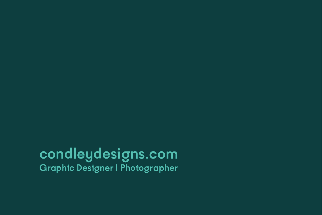
The final identity features a combined K+C mark that forms a shape reminiscent of the ASL "okay" gesture, creating a unique and meaningful visual connection within the design. The completed branding system was applied to a business card concept where the logo mark appears to hold the name between its "fingers", reinforcing the relationship between symbol and my personal identity. This project strengthened my ability to create meaningful visual solutions that merge symbolism, functionality, and personal storytelling.